
ProjectBrand Identity
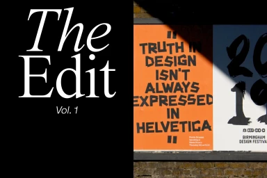
Birmingham Design Festival Brand Identity 2019
Associated creatives


Tags
Description
This graphic design showcase for the Birmingham Design Festival highlights a striking brand identity featuring large-scale typographic posters mounted on an exterior brick wall. The composition is divided vertically, contrasting a solid black panel bearing elegant white serif lettering that reads The Edit Vol. 1 with vibrant orange and blue promotional posters. The typography on the orange poster is bold and blocky, declaring truth in design, while the adjacent panel exhibits expressive dark brushstroke numerals against a white background. Natural daylight casts sharp diagonal shadows across the lower posters, adding structural depth to the outdoor display.