
ARKETYPE: Brand Identity

Apr 2026
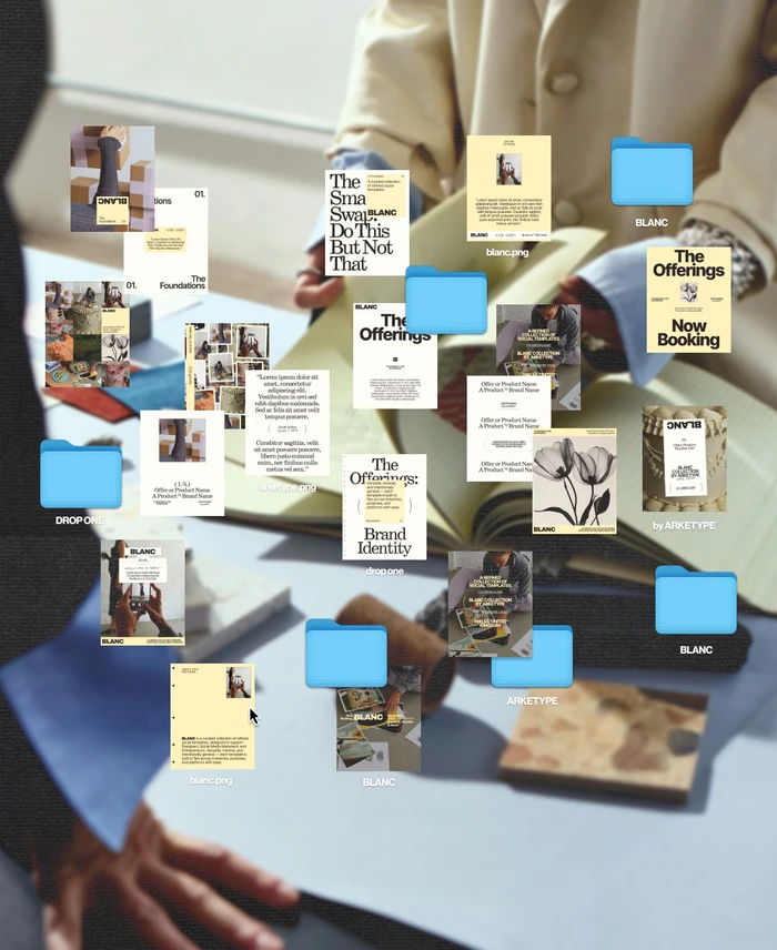
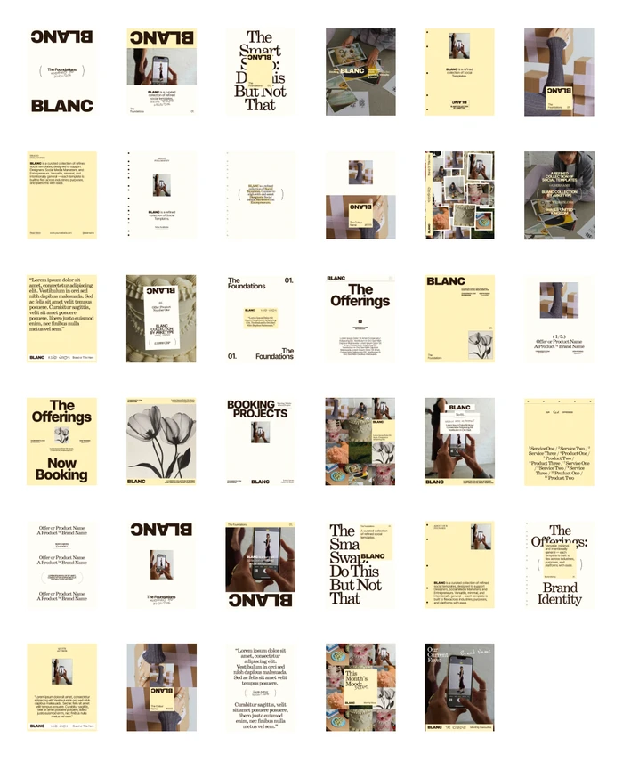
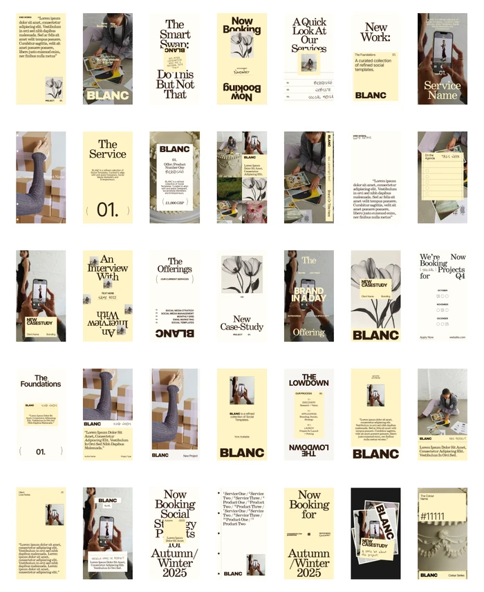
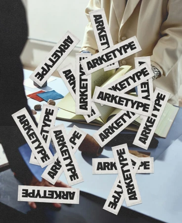
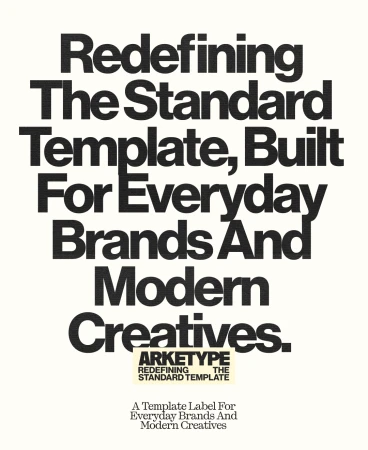
The brand identity for ARKETYPE emerges as a sophisticated exploration of visual structure, successfully bridging the gap between high-concept editorial aesthetics and the pragmatic needs of contemporary corporate design. Under the precise design direction of Studio&Jones, the project functions as a comprehensive brand identity system that prioritizes a refined, minimalist sensibility through the strategic use of negative space and a warm, cream-centric color palette. The execution skillfully blends documentary-style photography with clean, sans-serif typography, creating a cohesive visual language that feels both accessible and highly curated. By integrating complex collage techniques, including 3D render and CGI elements, the project effectively visualizes a modern workflow where digital interface assets interact with tactile, real-world objects like fabric swatches and architectural references. This synthesis of vectors and high-key lighting creates a professional yet approachable atmosphere, positioning ARKETYPE as a versatile tool for storytelling. Whether through its structured social media templates or bold, typographic wordmarks, the identity remains rooted in a disciplined hierarchy that favors clarity. The result is a highly polished commercial toolkit that manages to feel both human and systemic, offering a masterclass in how to maintain stylistic consistency while allowing for enough creative flexibility to support the diverse needs of modern brands and creative practitioners alike.
Vertical, Clean, Minimalist, Commercial
Typography
Advertising Campaign
