
Agua de Madre: Brand Identity

Jun 2025
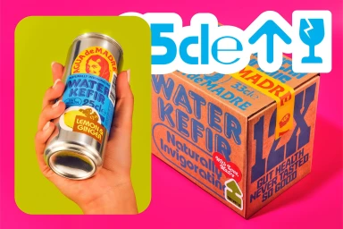
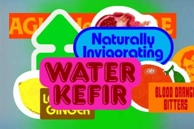
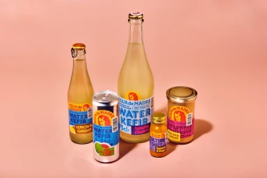
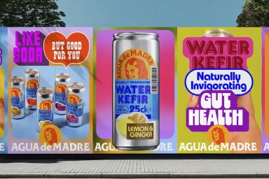
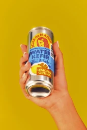
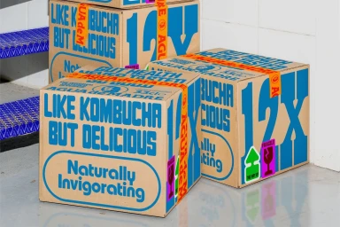
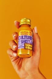
This brand identity project for Agua de Madre focuses on a vibrant, modern aesthetic across various physical touchpoints. Graphic designer Chris Chapman led the development of the visual system, which utilizes a bold palette of saturated pink, yellow, blue, and green hues to define the brand's presence in the beverage market. The project incorporates striking commercial photography and clean typography, often rendered with retro influences. Deliverables range from product packaging and aluminum cans to out-of-home advertising, such as billboards, and logistical elements like corrugated shipping boxes. The imagery makes frequent use of color blocking and vector graphics to maintain visual consistency across diverse formats.
Horizontal, Commercial, Warm
Solid Colour
E-commerce / Product
