
Agaché
Brand Identity

Jul 2020
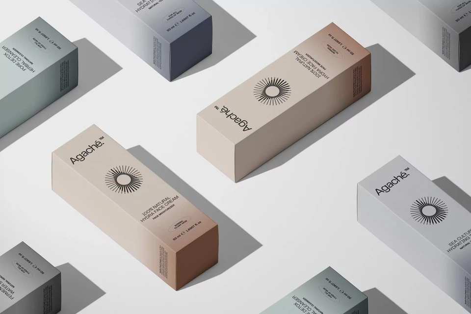
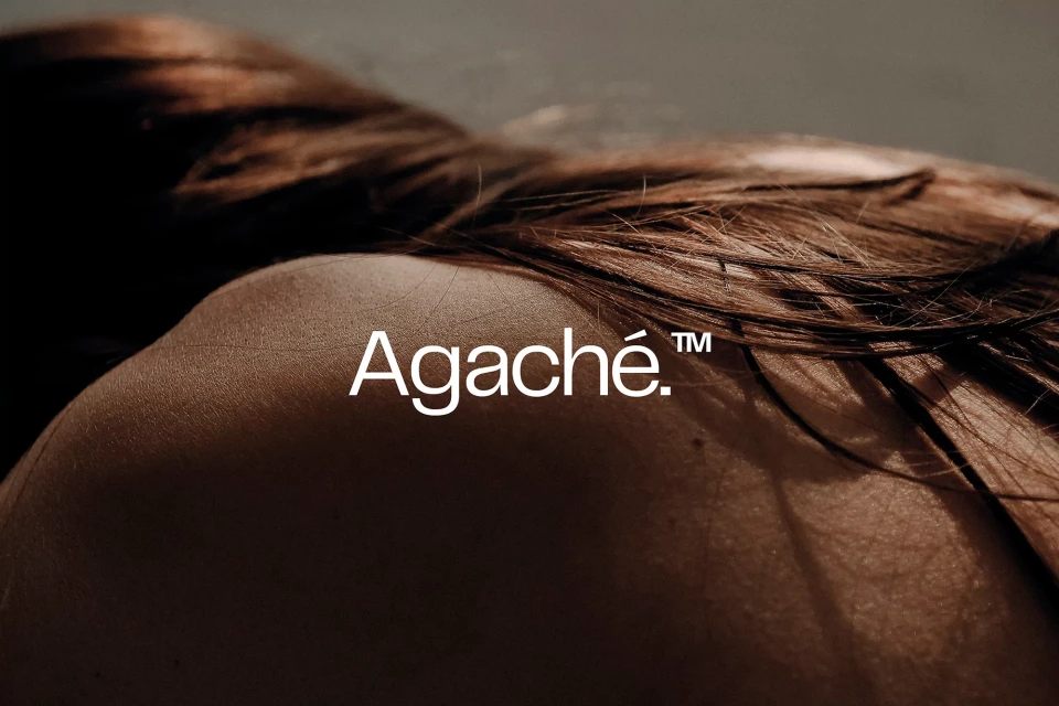
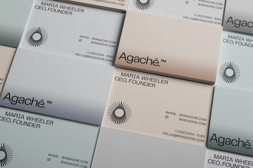
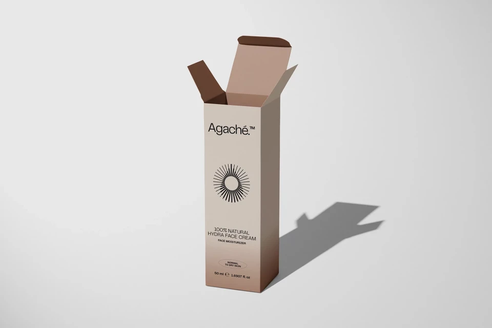
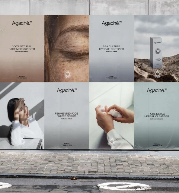
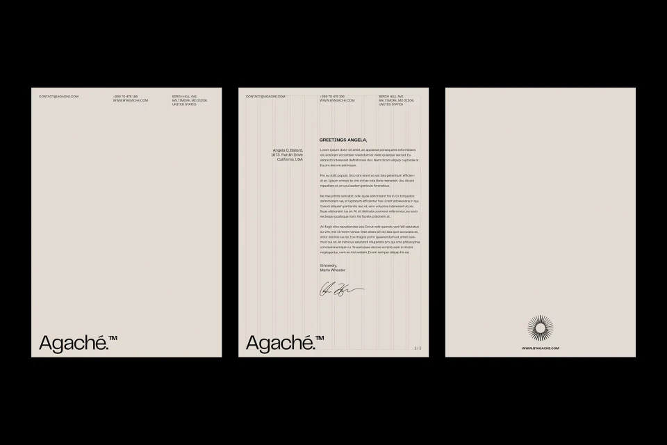
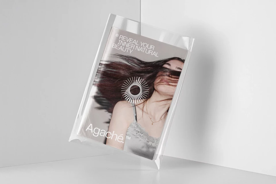
The brand identity for Agaché represents a masterclass in modern skincare design, balancing clinical precision with an organic, human-centric visual language. Executed by the design team at Alphamark, the project establishes a cohesive aesthetic that spans from minimalist product packaging to immersive outdoor advertising. By utilizing a restrained color palette of soft beige, cool grey, and muted teal, the identity leans into a premium beauty market position, emphasizing the brand's commitment to natural ingredients. The creative execution is anchored by a consistent use of clean, sans-serif typography and a striking geometric sunburst icon that appears as a recurring graphic anchor across both digital assets and physical stationery. Across various touchpoints, including high-key studio product shots and gritty urban placements, the branding remains remarkably versatile. The project utilizes natural light and soft-focus techniques to highlight skin texture, effectively blurring the lines between corporate professionalism and intimate editorial storytelling. This visual consistency is further bolstered by a rigorous grid-based layout for business collateral, ensuring that every touchpoint conveys a sense of quiet, sophisticated confidence. By blending macro photography with minimalist UI illustration, Alphamark has successfully crafted a brand presence that feels both approachable and authoritative, proving that effective skincare branding relies as much on negative space and disciplined composition as it does on its core message of natural, radiant health.
Horizontal, Commercial, Clean, Minimalist
Typography
Skincare
