
A Kind of Guise
Brand Identity
Feb 2018
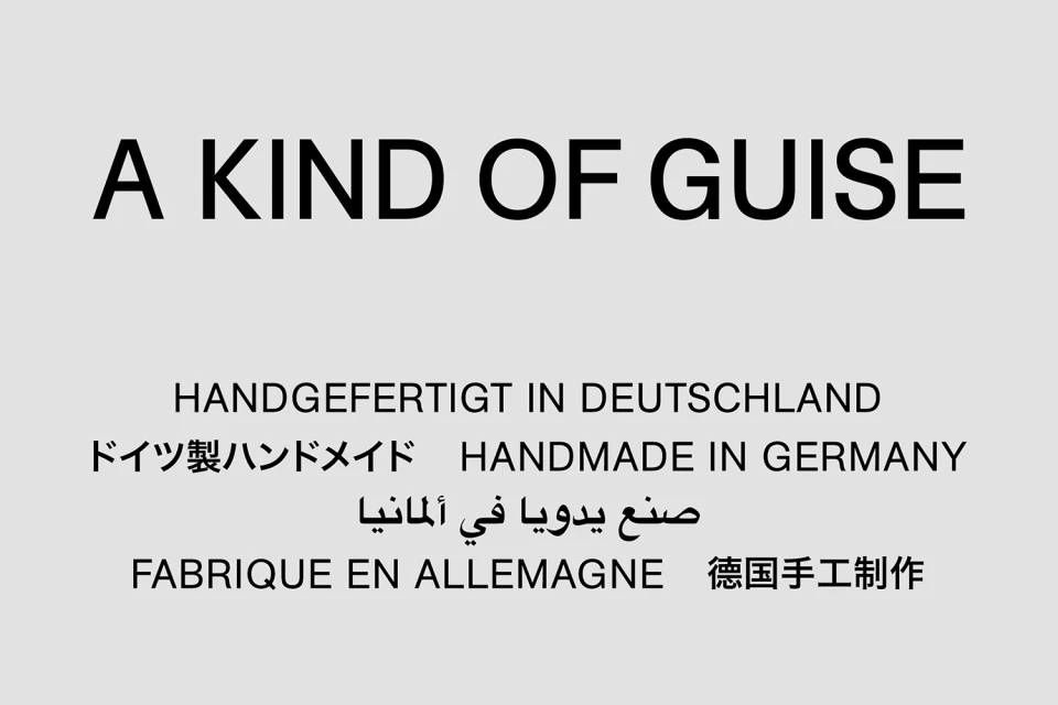
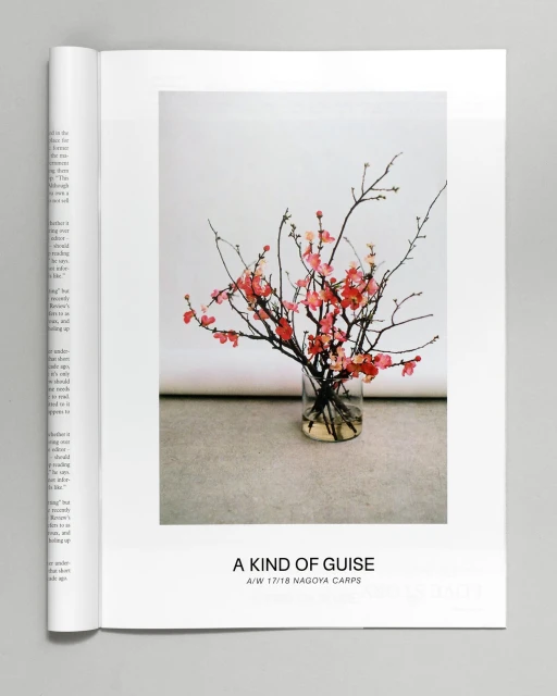
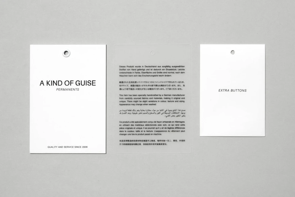
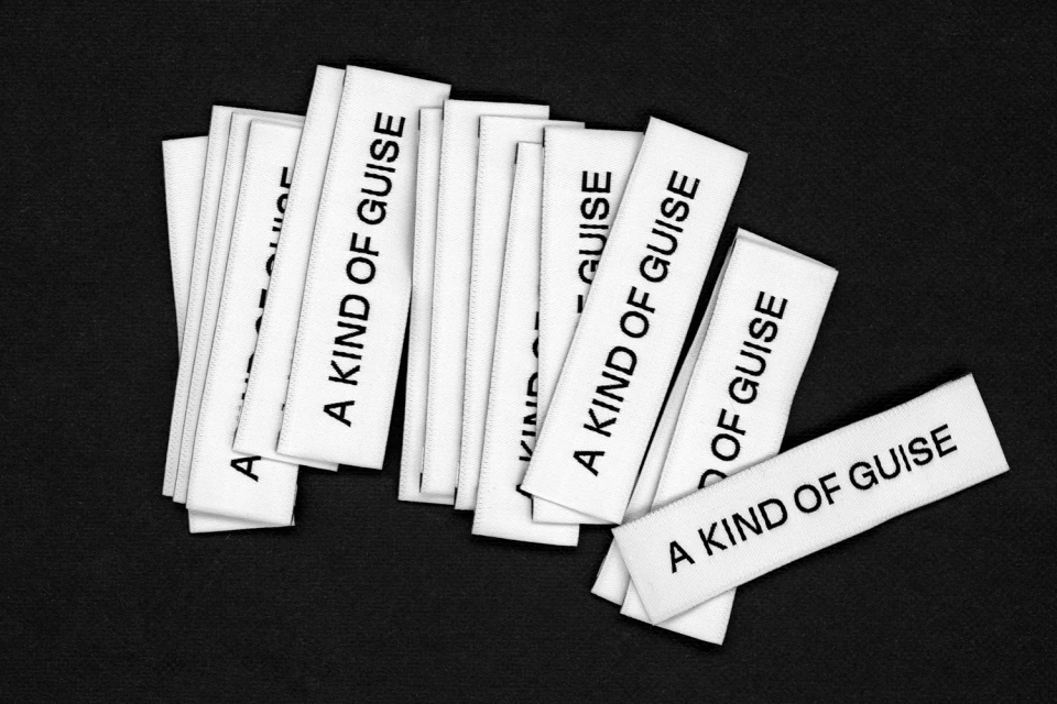
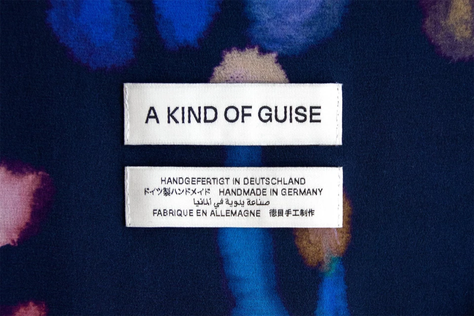
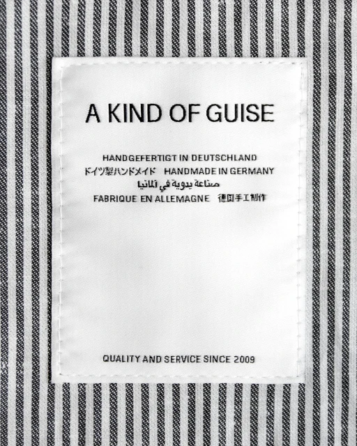
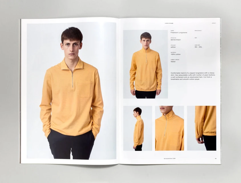
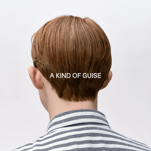
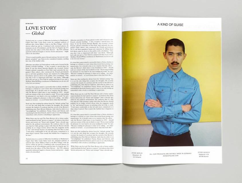
In the realm of luxury fashion, brand identity is defined by the meticulous intersection of heritage and visual restraint. For A Kind of Guise, the development of their comprehensive brand identity manifests as a masterclass in editorial minimalism, grounding the brand's German-made provenance in a series of clean, rigorous compositions. By utilizing sharp typography and high-key lighting, the work transcends simple labeling to communicate an ethos of craftsmanship. The project, supported by the graphic design expertise of Daily Dialogue, treats utilitarian elements—such as woven garment tags and production labels—with the same reverence as hero product photography. Through these media assets, the brand leans into a clinical, professional aesthetic that emphasizes quality and service, seamlessly bridging the gap between commercial product cataloging and sophisticated editorial storytelling. Whether captured through macro studio shots that highlight the uniform stitching of a label or through lifestyle portraits that utilize live-action techniques, the project maintains a cohesive, symmetrical visual language. This identity does not rely on trends; instead, it reinforces the permanence of the house through a disciplined, multi-lingual typographical hierarchy that feels both globally accessible and intimately artisanal. By stripping away visual clutter, the work allows the integrity of the clothing—and the philosophy behind its creation—to serve as the primary narrative, establishing a distinct, timeless signature within the competitive luxury sector.
Commercial, Clean, Horizontal
Designer Fashion
