
21st Europe: Brand Identity



Feb 2026
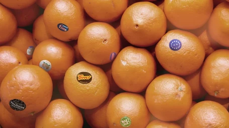
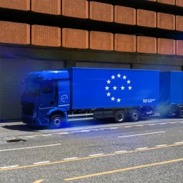
21st Europe’s comprehensive brand identity project, designed by DADA Projects, establishes a cohesive visual language across diverse physical and digital touchpoints. The system relies on a minimalist aesthetic, pairing clean typography with a signature blue and white color palette, accented by a distinct star-motif iconography. This approach unites a wide range of product applications, from garment labeling and logistics packaging to advanced digital interfaces. The project demonstrates technical versatility, moving between industrial product design and digital UI illustration. Macro photography and 3D render techniques highlight the tactile quality of materials—spanning leather, glass, and corrugated textures—while maintaining consistency through recurring "Made in Europe" and environmental impact branding. This design framework serves as a structured communication tool, effectively translating sustainability metrics and manufacturing provenance into a clear, consumer-facing experience.
Commercial, Clean, Horizontal
E-commerce / Product
