
Brand
ProjectBrand Identity
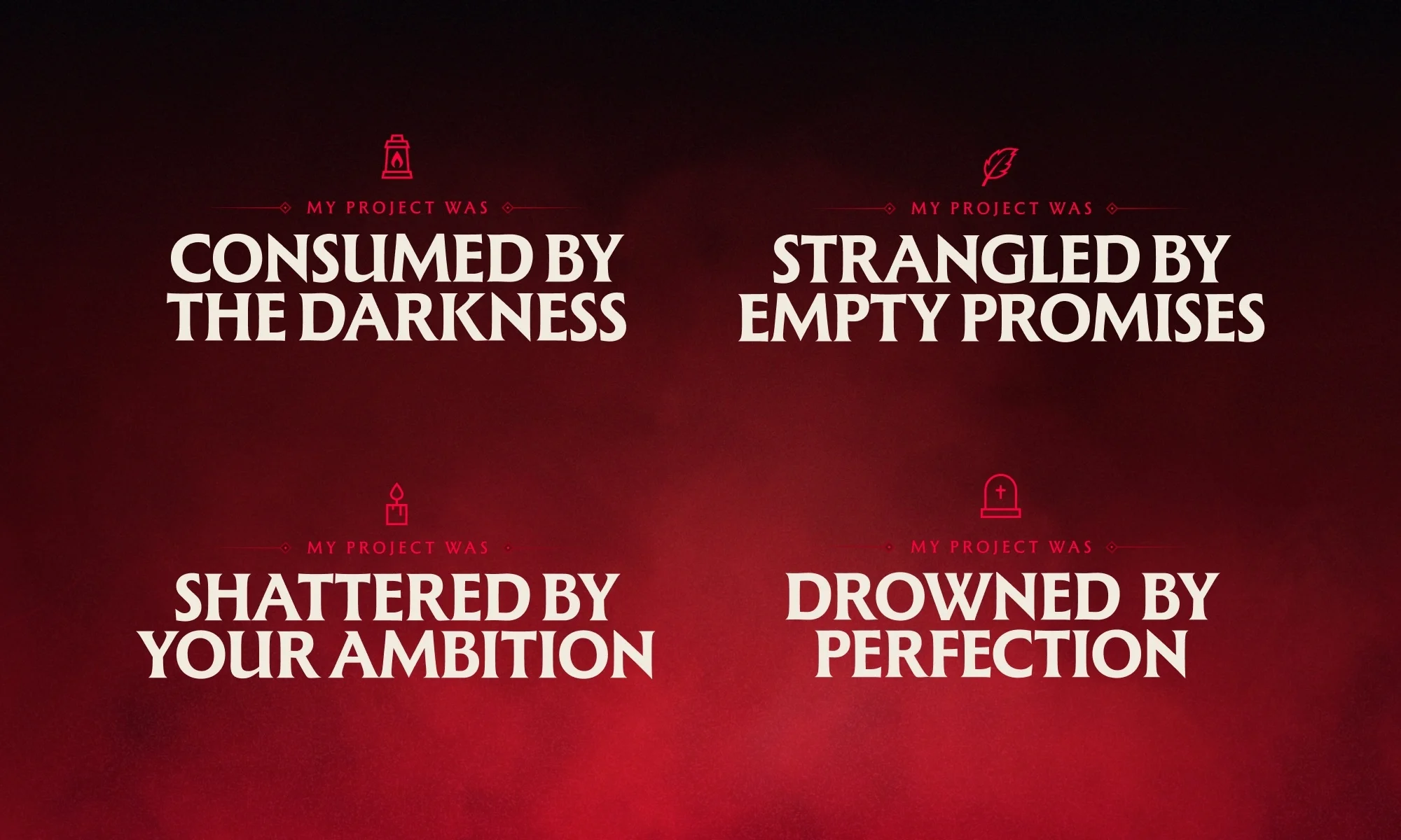
Wondermake Brand Identity 2025
Associated creatives


Tags
Description
This graphic design piece for the Wondermake brand identity showcases four distinct typographic statements arranged in a two-by-two grid against a deep red gradient background. Each text block reads MY PROJECT WAS followed by a dramatic phrase set in heavy white capital letters, accompanied by a small red icon above. The composition employs bold serif typography with clean alignment and subtle atmospheric lighting effects. The work reflects a cohesive visual system created for the Wondermake project.