
BrandThe Soap Co.
ProjectBrand Identity
Paul Belford Ltd, Projects by,
Associated creatives

Tags
Description
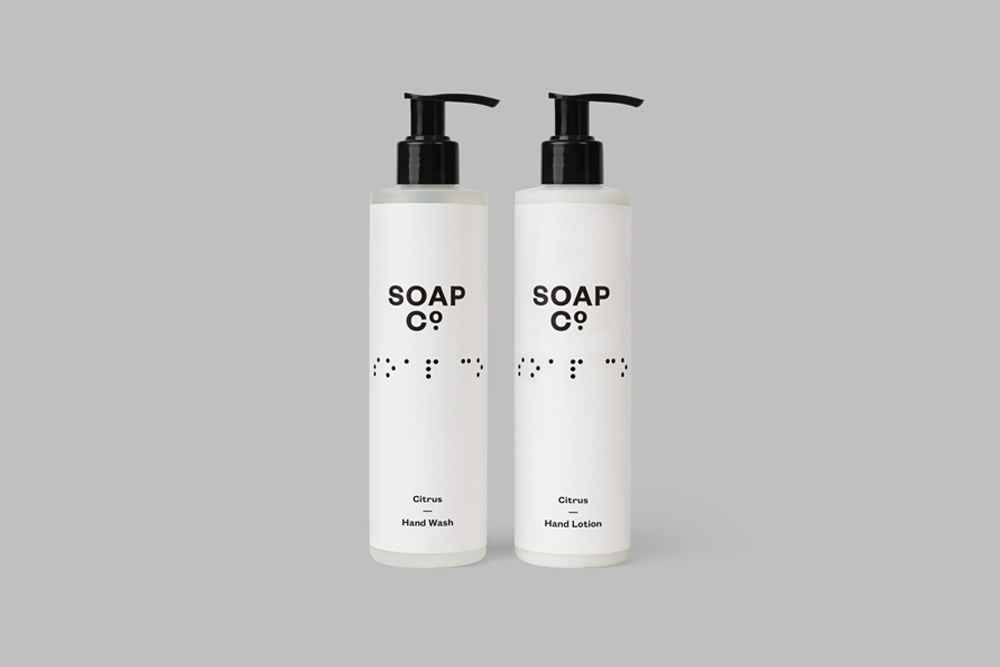
Two identical white cylindrical bottles are placed side-by-side against a flat, neutral grey background. Each bottle is topped with a matte black pump dispenser. The labels prominently feature the text 'SOAP CO' above a row of braille characters, with the text 'Citrus' and either 'Hand Wash' or 'Hand Lotion' printed at the bottom. The lighting is uniform and soft, typical of commercial product photography, creating subtle shadows that define the cylindrical shapes. The overall composition is minimalist and balanced, emphasizing the clean lines and accessibility-focused packaging design of the brand.
Style
Commercial
Techniques
Studio strobe
Industries
Skincare