
Brand
ProjectBrand Identity
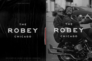
The Robey Brand Identity 2016
Associated creatives

Tags
Description
This graphic design piece for The Robey brand identity features a high-contrast black and white layout with bold typography. The composition is divided into two panels, with the left side showing a textured dark surface and the right displaying a couple riding a vintage chopper motorcycle on a city street. The branding text reads The Robey Chicago alongside contact details and location information. Javas Lehn Studio handled the graphic design for the project. The overall aesthetic is gritty, monochromatic, and retro.