
BrandThe Fisheries
ProjectBrand Identity
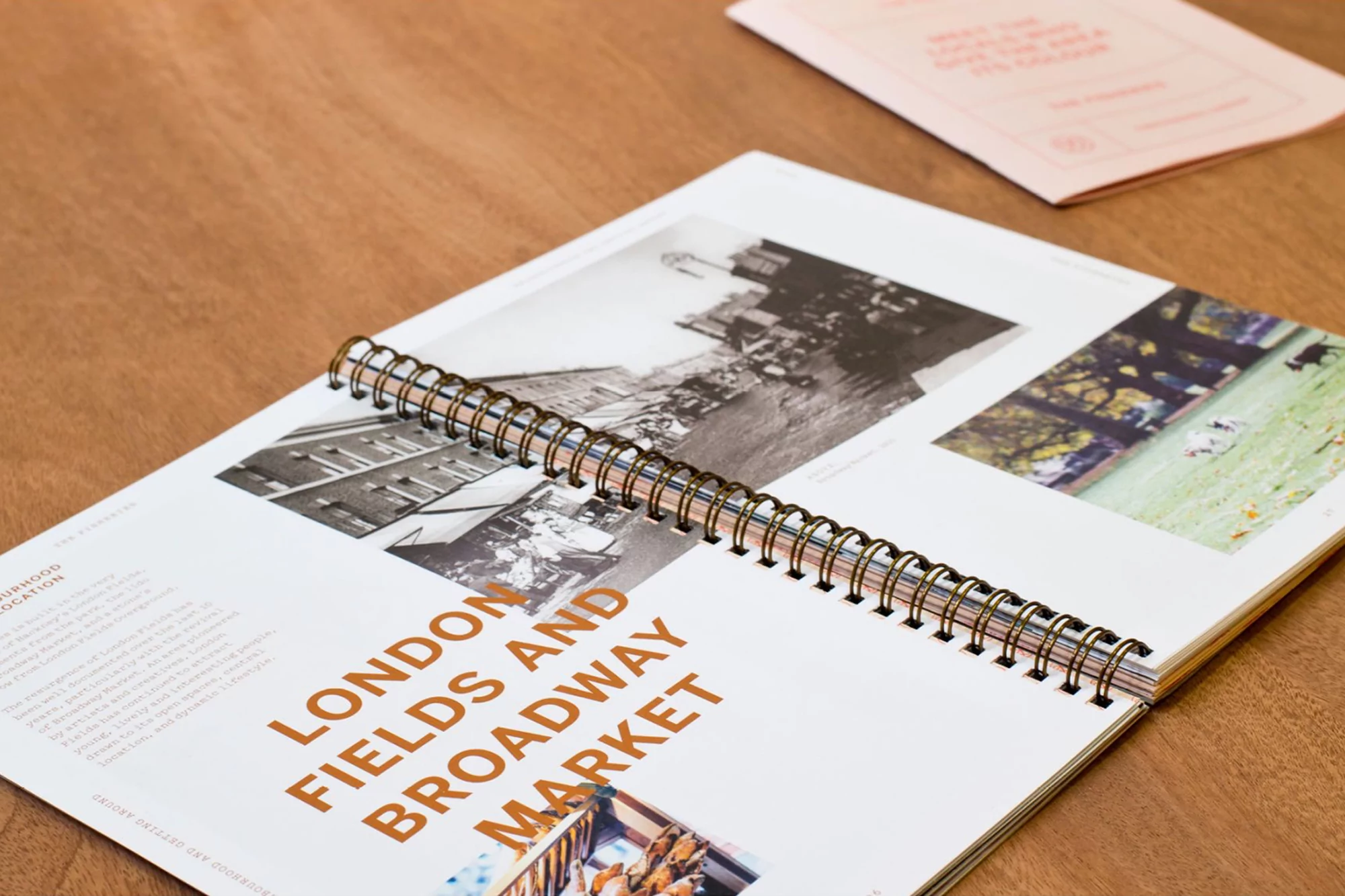
The Fisheries Brand Identity 2018
Associated creatives

Tags
Description
An open spiral-bound publication lies flat on a warm wooden tabletop, showcasing editorial layouts, historical black and white photography, and bold typography. The visible pages feature headings in a distinct warm brown tone reading London Fields and Broadway Market, alongside small columns of descriptive text and curated imagery. A smaller pink brochure rests in the upper right corner of the composition. The layout demonstrates structured graphic design and thoughtful editorial pagination. Studio Blackburn handled the graphic design for this brand identity project for The Fisheries.
Style
Horizontal, Corporate, Clean, Polished
Techniques
Typography, Natural light
Color
Camel (30%)
Pure White (50%)
Jet Black (20%)
Background
Wood Texture
Context
Lookbook