
Brand
ProjectBrand Identity
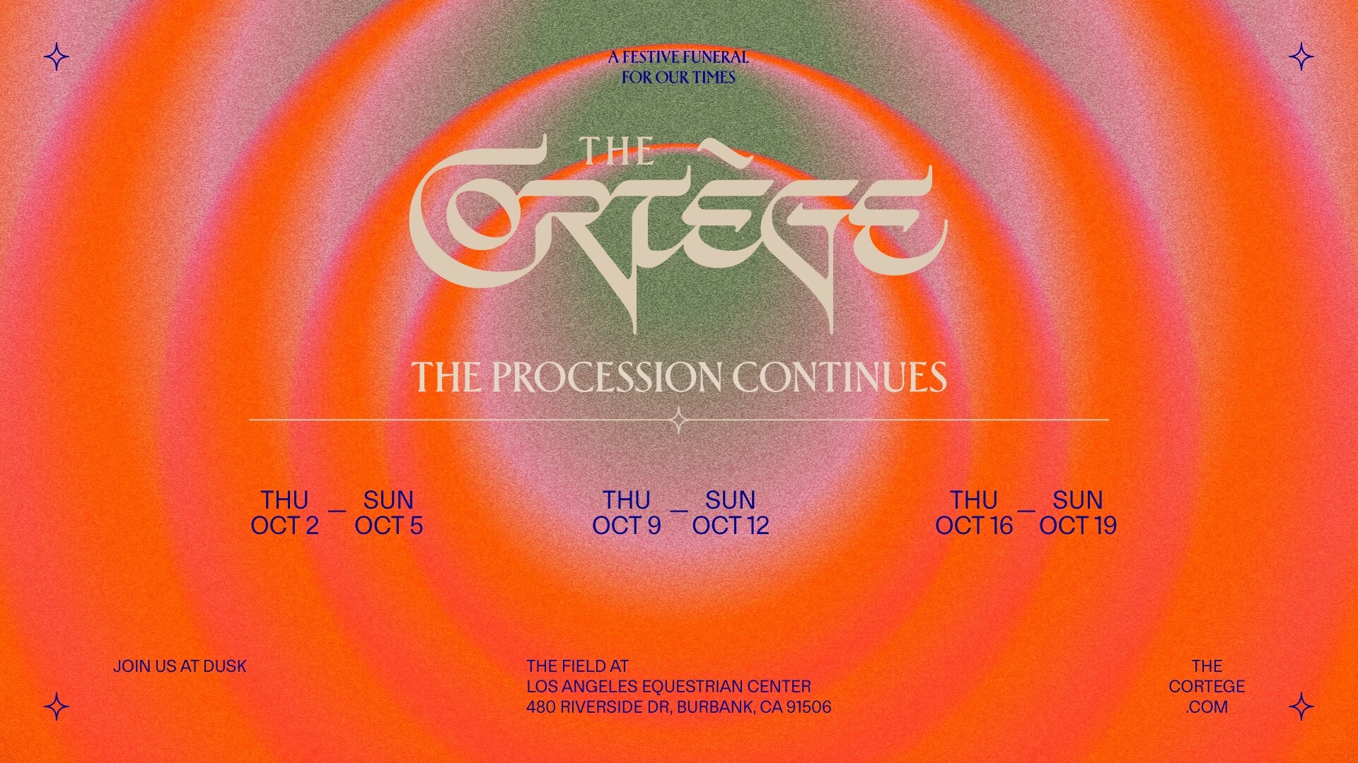
The Cortège Brand Identity 2026
Associated creatives


Tags
Description
This graphic design piece showcases the brand identity and event promotion for The Cortège, featuring concentric circular gradients in shades of orange, red, and green with a grainy, retro-inspired texture. Central custom typography displays the brand name alongside subtitle text reading The Procession Continues and dates in October. Additional event details and location information are positioned across the lower portion of the frame, framed by small decorative starburst icons in the corners. The composition employs a balanced, symmetrical layout with a warm, nostalgic color palette.