
BrandSteep St.
ProjectBrand Identity
Christopher Doyle & Co., Graphic Design,
Associated creatives

Tags
Description
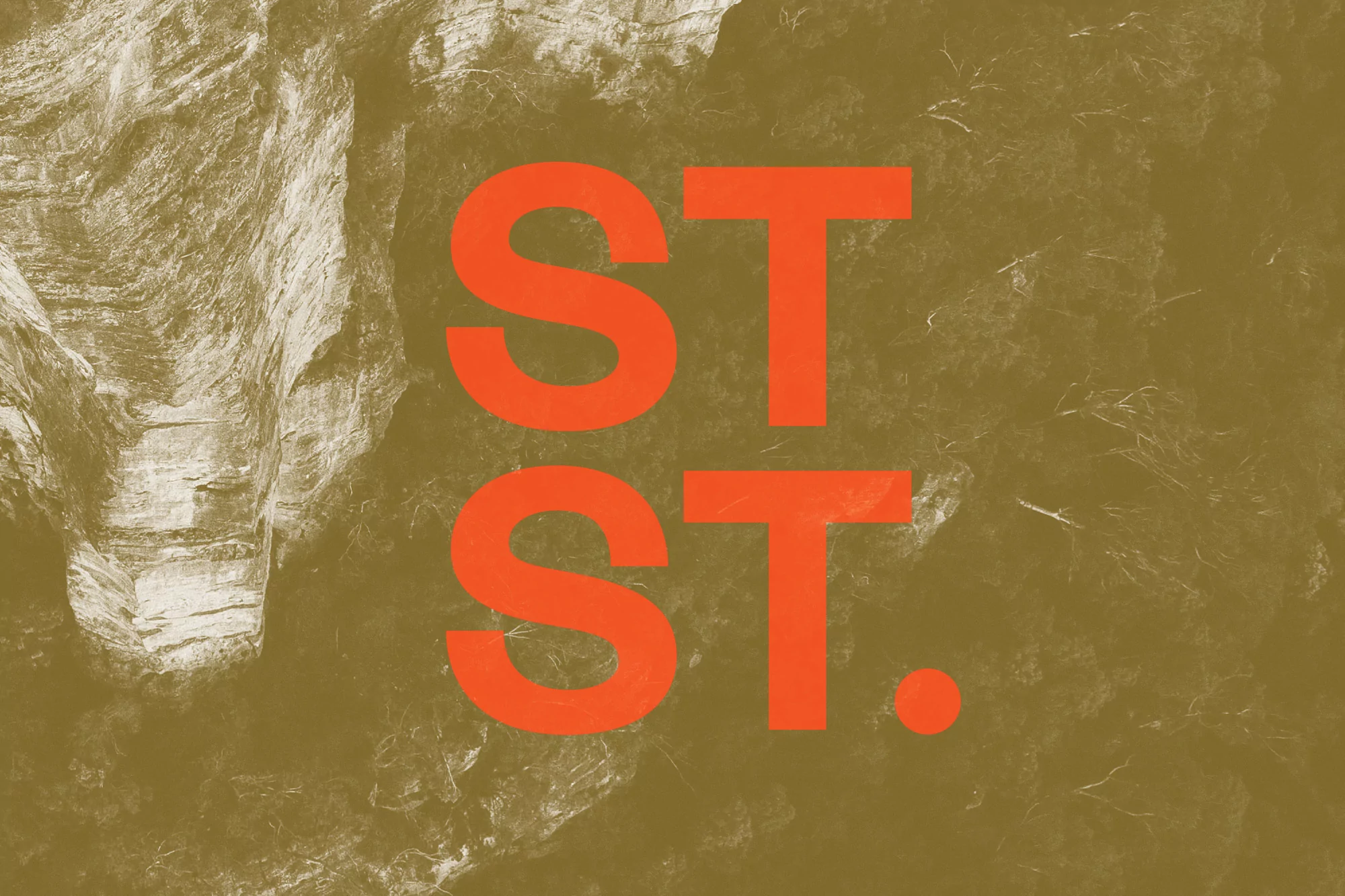
This graphic design piece presents the brand identity for Steep St. centered on bold, bright orange sans-serif typography that reads "ST. ST." with a period. The text is superimposed over an earthy, olive-brown textured photographic background that shows hints of rock formations and foliage. The composition is clean and minimalist, allowing the high-contrast orange text to stand out against the muted, organic tones of the backdrop. The visual style is modern, professional, and refined. It serves as a strong example of minimalist branding, emphasizing clarity and visual impact.
Style
Commercial
Techniques
Typography
Industries
Enterprise & B2B Software