
Brand
ProjectBrand Identity
G . F Smith, Paper,
Associated creatives





Tags
Description
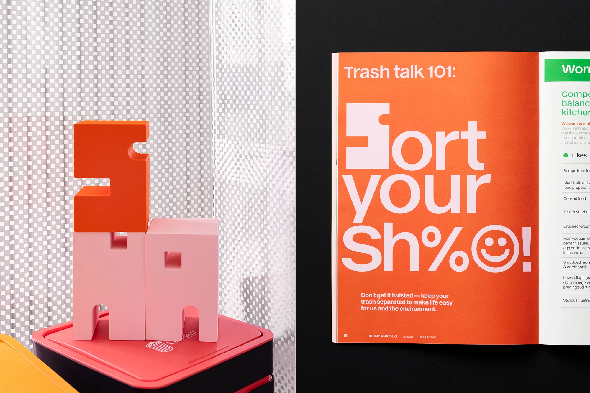
This image showcases a brand identity project for Samson, highlighting creative editorial design and bespoke typography. On the right, an open magazine spread features a striking orange page with bold white typography reading Trash talk 101 and Sort your Sh%, paired with clean column layouts. On the left, three tactile geometric letter blocks in vibrant orange and soft pink are stacked neatly on a red storage container. The composition is set against a textured white translucent screen and a solid black background, creating high-contrast visual depth. The clean lighting and crisp studio setup emphasize the physical paper textures and printed materials.
Style
Editorial, Horizontal, Warm, Clean
Techniques
Typography
Color
Burnt Orange (50%)
Blush (30%)
Pure White (20%)
Background
Textured Backdrop
Context
Editorial