
ProjectBrand Identity
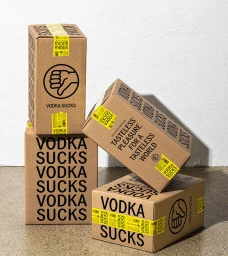
RockFilter Distillery Brand Identity 2024
Associated creatives


Tags
Description
Four rectangular cardboard packaging boxes are arranged in a dynamic stack against a textured white wall and a light concrete surface. The boxes feature prominent black typography reading VODKA SUCKS alongside a thumbs-down icon and bright yellow security seal tape. The composition is lit with direct hard light that casts distinct shadows to the right of each box. The packaging design was created for RockFilter Distillery with graphic design by Werner Design Werks and photography by Colin Houck.