
BrandReparations Club
ProjectBrand Identity
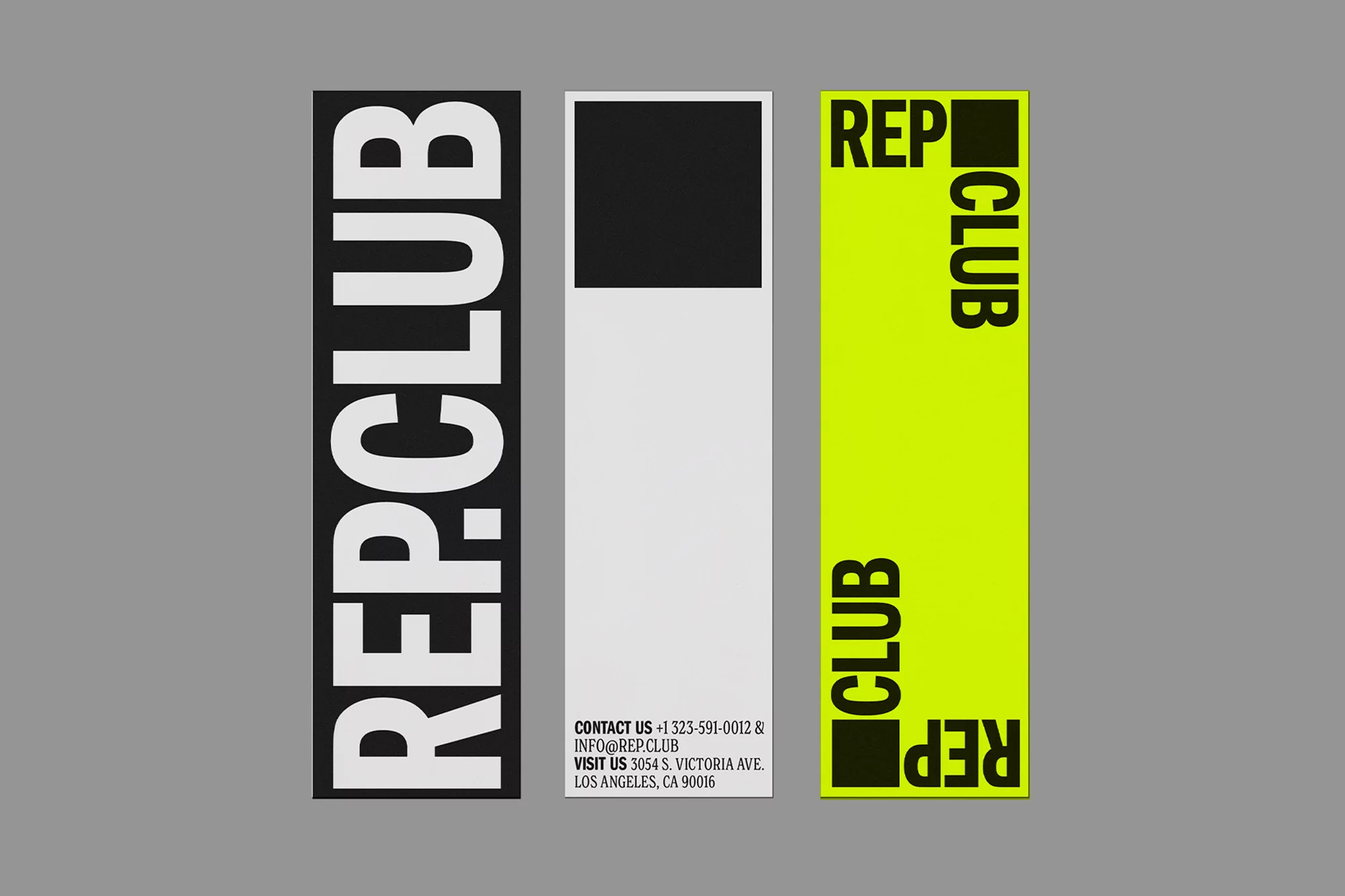
Reparations Club Brand Identity 2021
Associated creatives


Tags
Description
This brand identity project for Reparations Club showcases three distinct vertical layout variations featuring bold sans-serif typography. The left layout utilizes a stark black background with prominent white vertical text reading REP CLUB. The center layout presents a minimalist white design featuring a solid black square at the top and contact information arranged neatly at the bottom. The right layout uses a vibrant lime green background with rotated black typography and solid black square accents. Graphic design work was contributed by Sometimes Always and Estúdio Daó.
Style
Artistic, Vertical, Graphic
Techniques
Typography
Color
Jet Black (30%)
Pure White (30%)
Lime (30%)
Background
Grey Seamless
Context
Advertising Campaign