
BrandReparations Club
ProjectBrand Identity
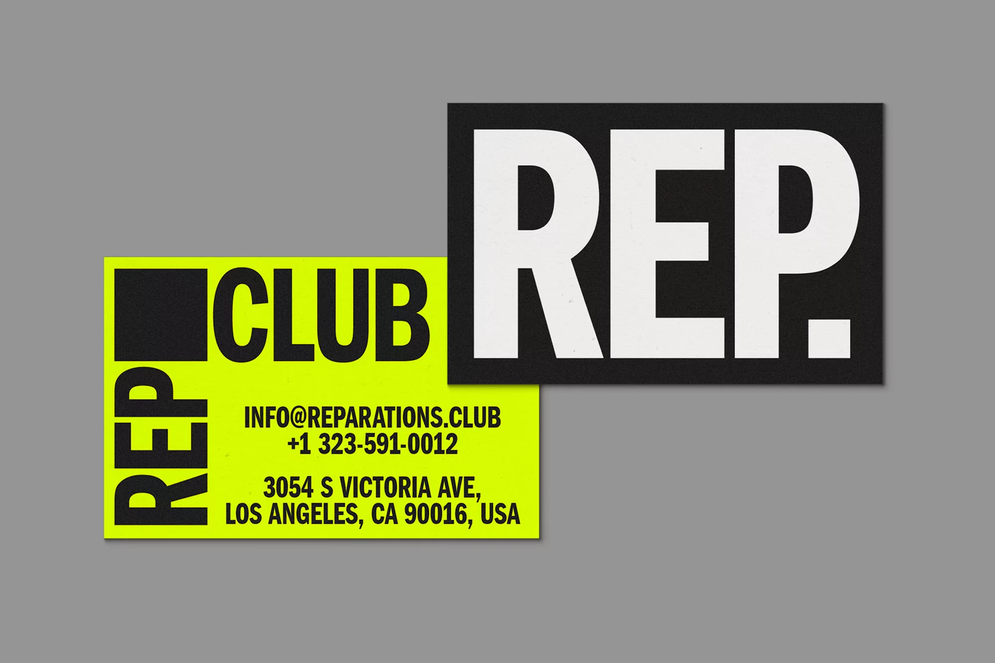
Reparations Club Brand Identity 2021
Associated creatives


Tags
Description
Graphic design brand identity project for Reparations Club created by Sometimes Always and Estúdio Daó. The composition showcases two rectangular cards overlapping against a solid grey backdrop. The upper right card is black with large bold white typography reading REP. while the lower left card is a vibrant lime green with black text reading CLUB and contact details including an address in Los Angeles, California. The clean layout emphasizes high contrast and striking typography.
Style
Horizontal, Commercial, Graphic
Techniques
Typography, Vector
Color
Pure White (40%)
Lime (30%)
Jet Black (30%)
Background
Grey Seamless
Context
Website / Web