
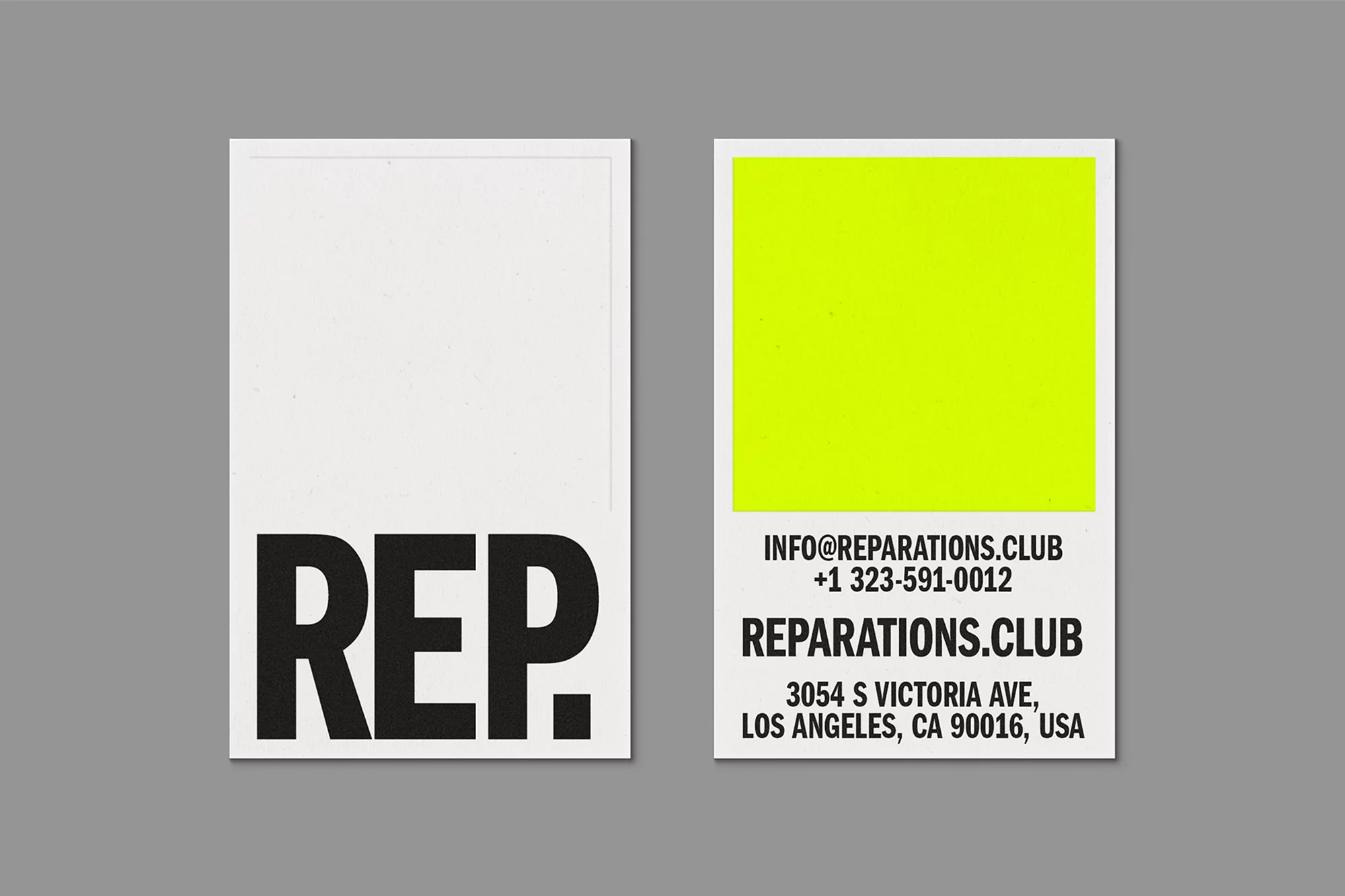
Reparations Club Brand Identity 2021
Associated creatives


Tags
Description
This graphic design piece presents the front and back layouts of a minimalist business card created for Reparations Club as part of their brand identity project. Designed by Sometimes Always and Estudo Dao, the card features crisp white surfaces contrasted with bold black sans-serif typography and a striking solid yellow block on the reverse side. The front prominently displays the abbreviation REP in heavy black capital letters. The back includes contact details and address information formatted in clean, legible text below the vibrant colour block. The cards are displayed flat against a neutral grey background, highlighting the clean graphic lines and high-contrast color palette.
Style
Horizontal, Commercial, Clean, Minimalist, Graphic
Techniques
Typography, Vector
Color
Background
Grey Seamless
Context
Advertising Campaign