
BrandQ Le BAKER
ProjectBrand Identity
Never Now, Graphic Design,
Associated creatives

Tags
Description
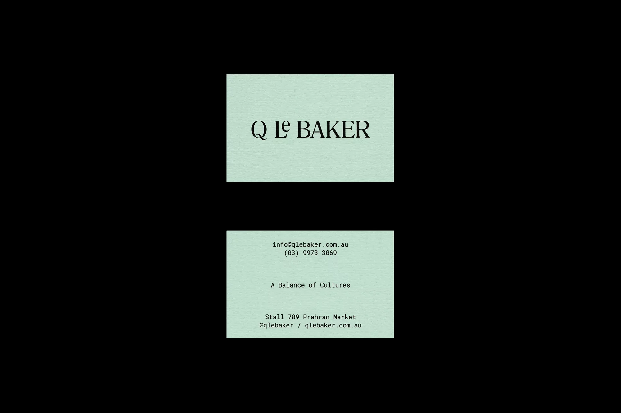
This composition features two business cards from Q Le Baker arranged against a stark black background. The top card displays the brand name in a classic, elegant black serif font on a light mint green background with a subtle paper texture. The bottom card contains contact information, including an email address, phone number, and location, set in a modern, clean sans-serif typeface. The overall aesthetic is minimalist, focusing on clear hierarchy and refined typographic balance. The use of soft mint green creates a distinct contrast against the surrounding black, emphasizing the professional and sophisticated branding.
Style
Commercial, Corporate
Techniques
Typography
Industries
Restaurants