
BrandPorto City Theatre
ProjectBrand Identity
Oscar Maia, Graphic Design,
Associated creatives

Tags
Description
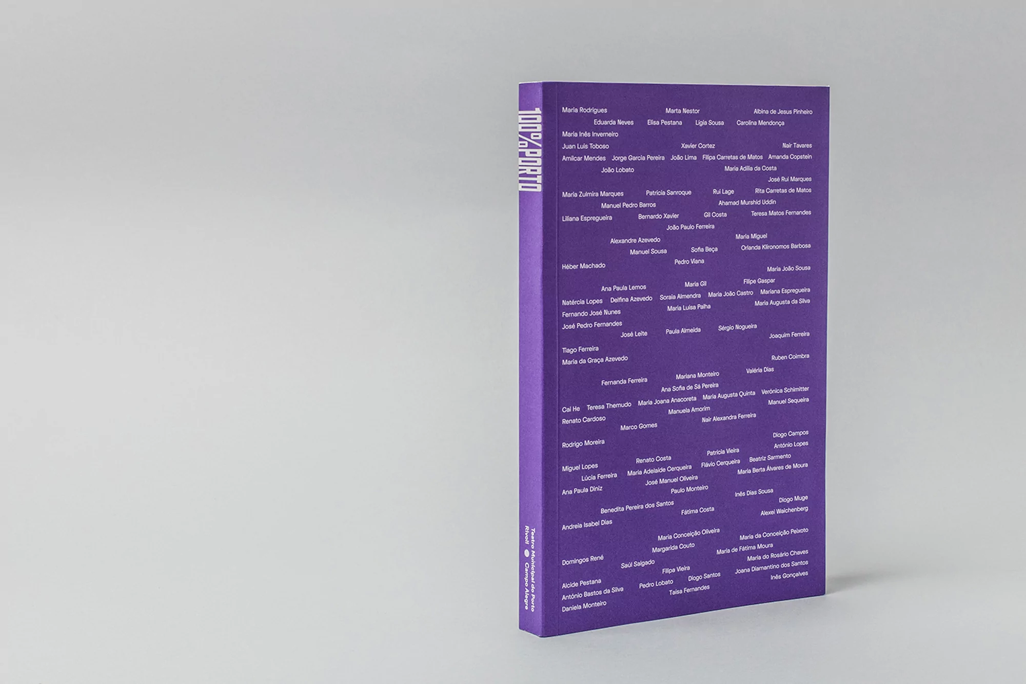
This high-contrast product photograph features the cover of a book titled 100% PORTO, designed for the Porto City Theatre brand identity. The book is oriented vertically and stands upright against a clean, light grey studio background. The cover is a deep, solid purple, densely populated with hundreds of white names typeset in a uniform, sans-serif font. The vertical spine displays the title 100% PORTO in a bold, clean typeface, while the lower spine contains small, vertically oriented white text detailing the institution's name and related credits. The overall composition is symmetrical, clean, and highlights the graphic, typographic-focused design aesthetic.
Style
Commercial
Techniques
Typography
Industries
Digital Media & Publishers