
ProjectBrand Identity
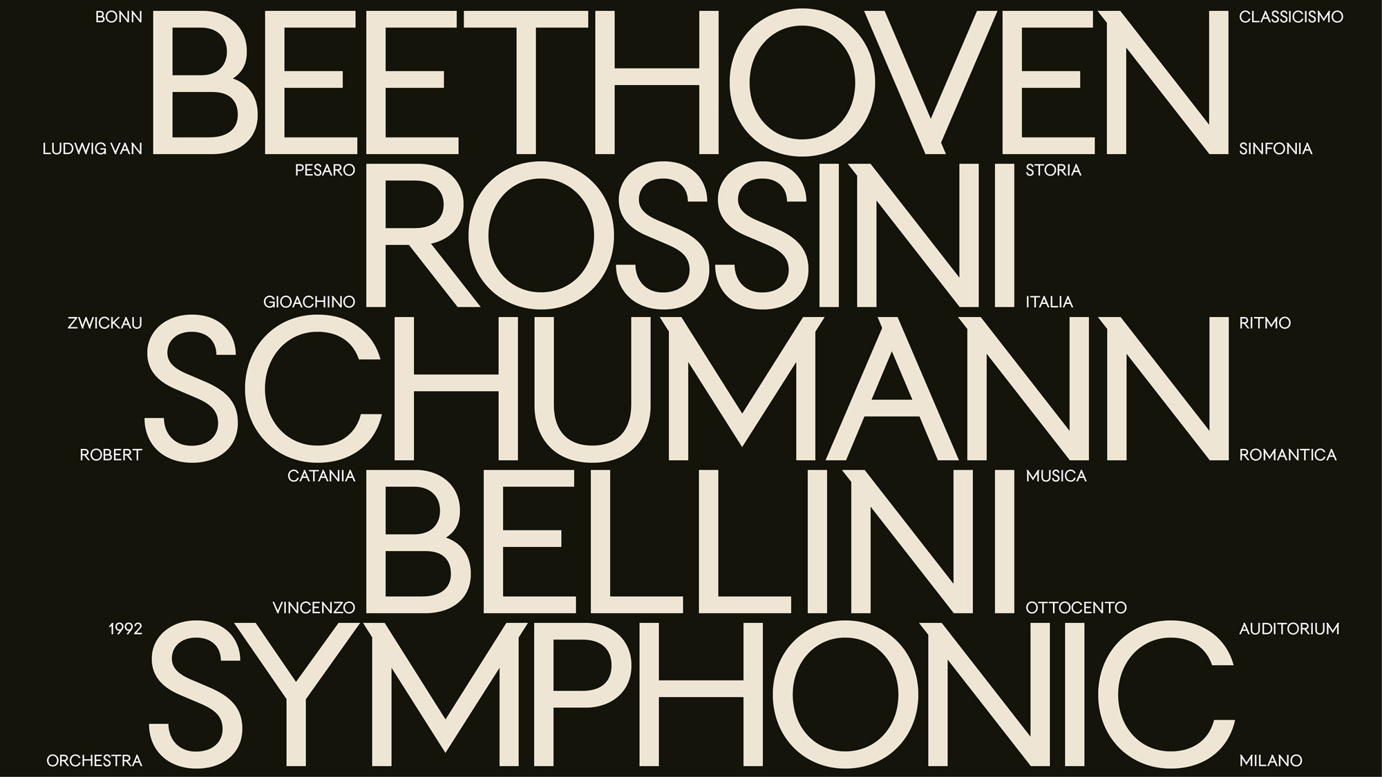
Orchestra Sinfonica Di Milano Brand Identity 2023
Associated creatives


Tags
Description
This graphic design project for the Orchestra Sinfonica Di Milano brand identity features bold serif typography arranged in a striking composition against a dark ground. Prominent composer names including Beethoven, Rossini, Schumann, and Bellini are set in large, clean cream-coloured lettering alongside smaller supporting musical terms and geographic markers. The visual design centers on clean lines and strong typographic hierarchy typical of high-end cultural branding. Designed by Landor, the composition establishes a sophisticated tone that honors classical musical heritage.