
BrandLesse
ProjectBrand Identity
Natasha Mead, Graphic Design,
Associated creatives

Tags
Description
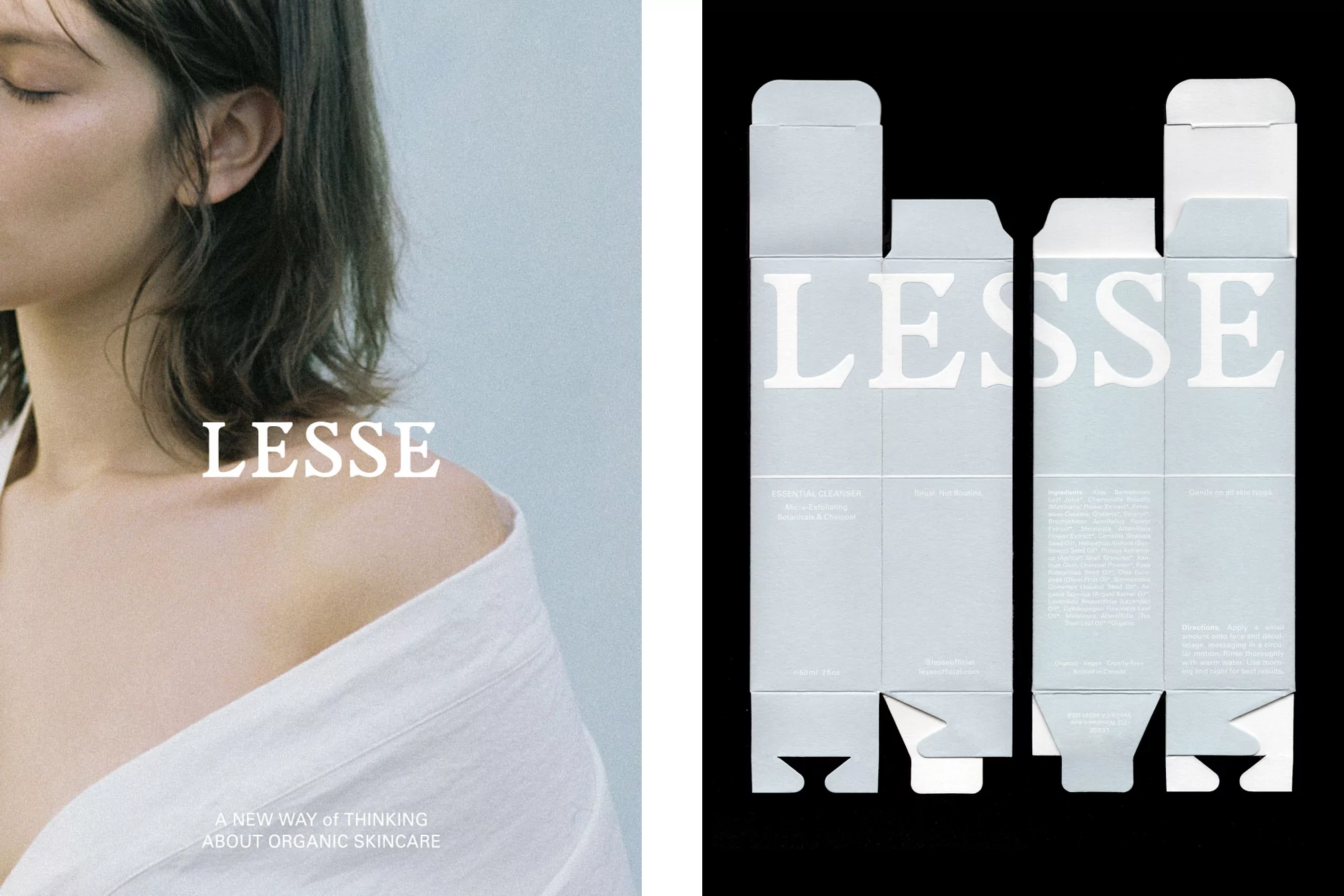
This brand identity for Lesse skincare combines high-end editorial photography with minimalist packaging design. On the left, a cropped portrait shows a person with their shoulder exposed and eyes closed, conveying a sense of natural calm. The Lesse brand name is overlaid in elegant serif typography. The right side features a flat-lay technical layout of the product box, rendered in a pale grey-blue hue against a deep black background. The typography is consistent across both panels, emphasizing a clean and sophisticated aesthetic throughout the presentation.
Style
Commercial, Corporate
Techniques
Typography, Infographics
Industries
Skincare