
ProjectBrand Identity
Brand Identity 2025
Associated creatives


Tags
Description
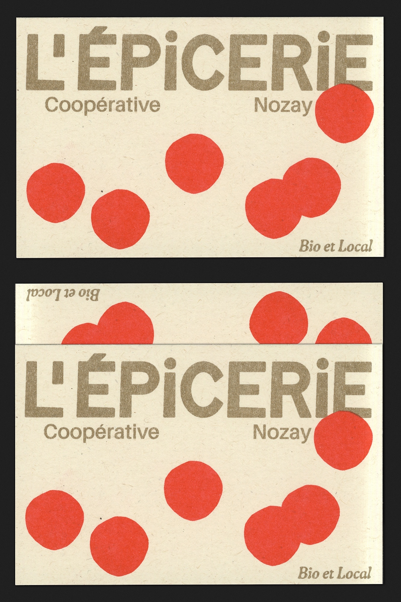
This project showcases brand identity and print design for L'Epicerie Cooperative de Nozay, featuring two printed cards with cream-colored textured paper stock. The composition displays bold brown typography spelling out the cooperative name alongside smaller subtitle text and scattered solid red circular shapes across the surface. The design includes credits for Appelle moi Papa, Grand Royal Studio, and Parades. The print work uses clean graphic layouts with distinct typographic hierarchy.
Style
Artistic, Vertical, Clean, Minimalist
Techniques
Typography, Screen print / silkscreen
Industries
CPG / Packaged Food
Color
Cream (70%)
Scarlet (20%)
Caramel (10%)
Background
Paper Texture
Context
Advertising Campaign, Catalogue