
Brand
ProjectBrand Identity
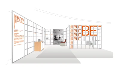
Isetan Brand Identity 2020
Associated creatives

Tags
Description
This interior architectural rendering showcases an exhibition space designed for the Isetan brand identity project by Systems Studio. The composition features clean, minimalist modular grid structures forming walls and partitions throughout the interior. Large white panels on the left display typographic elements and Japanese text alongside a wooden cabinet. Orange lettering reading 'BUT BETTER' is prominently integrated into the white grid framework on the right. The perspective leads the viewer toward a central doorway framing an inner room with a small armchair. The overall design utilizes a restrained color palette emphasizing white surfaces and crisp architectural lines.