
BrandHotel Glasnost
ProjectBrand Identity
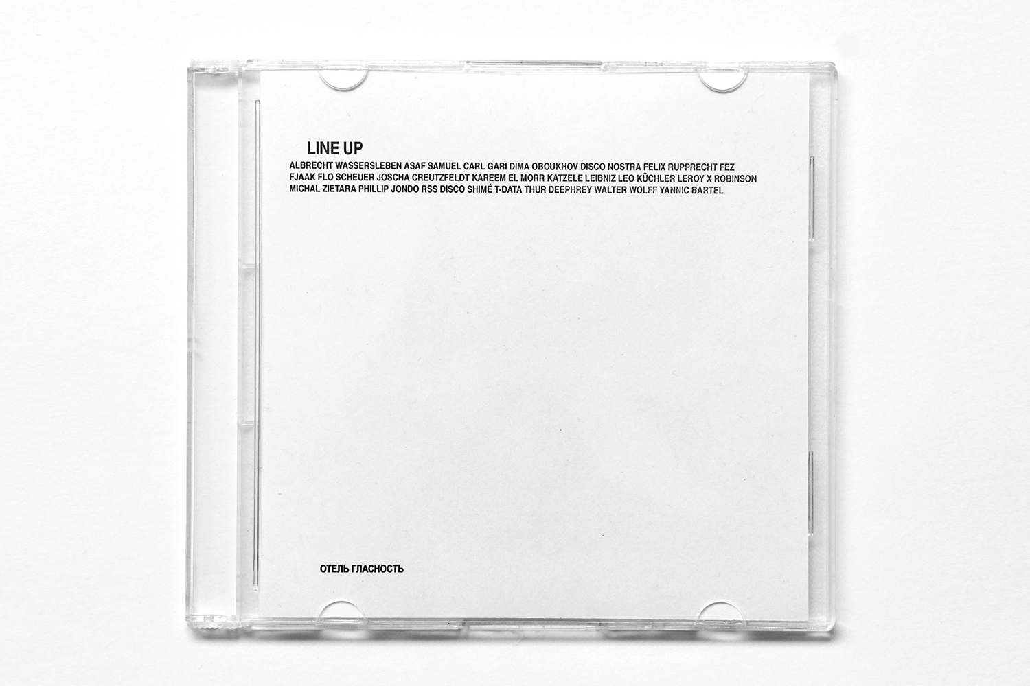
Hotel Glasnost Brand Identity 2018
Associated creatives

Tags
Description
This image showcases a clear plastic CD jewel case resting on a neutral white background as part of the Hotel Glasnost brand identity project. The interior paper insert features clean, minimalist black typography headed with the words LINE UP followed by artist names, alongside Cyrillic text in the lower corner. The lighting is bright and even, highlighting the transparent plastic contours and sharp print details. The composition is presented from a straight-on top-down perspective, emphasizing the graphic layout and packaging design. Daily Dialogue executed the graphic design for this branding project.
Style
Commercial, Square, Clean, Minimalist
Techniques
Typography
Industries
Music
Color
Pure White (70%)
Jet Black (30%)
Background
White Seamless
Context
Advertising Campaign, E-commerce / Product