
BrandFARE
ProjectBrand Identity
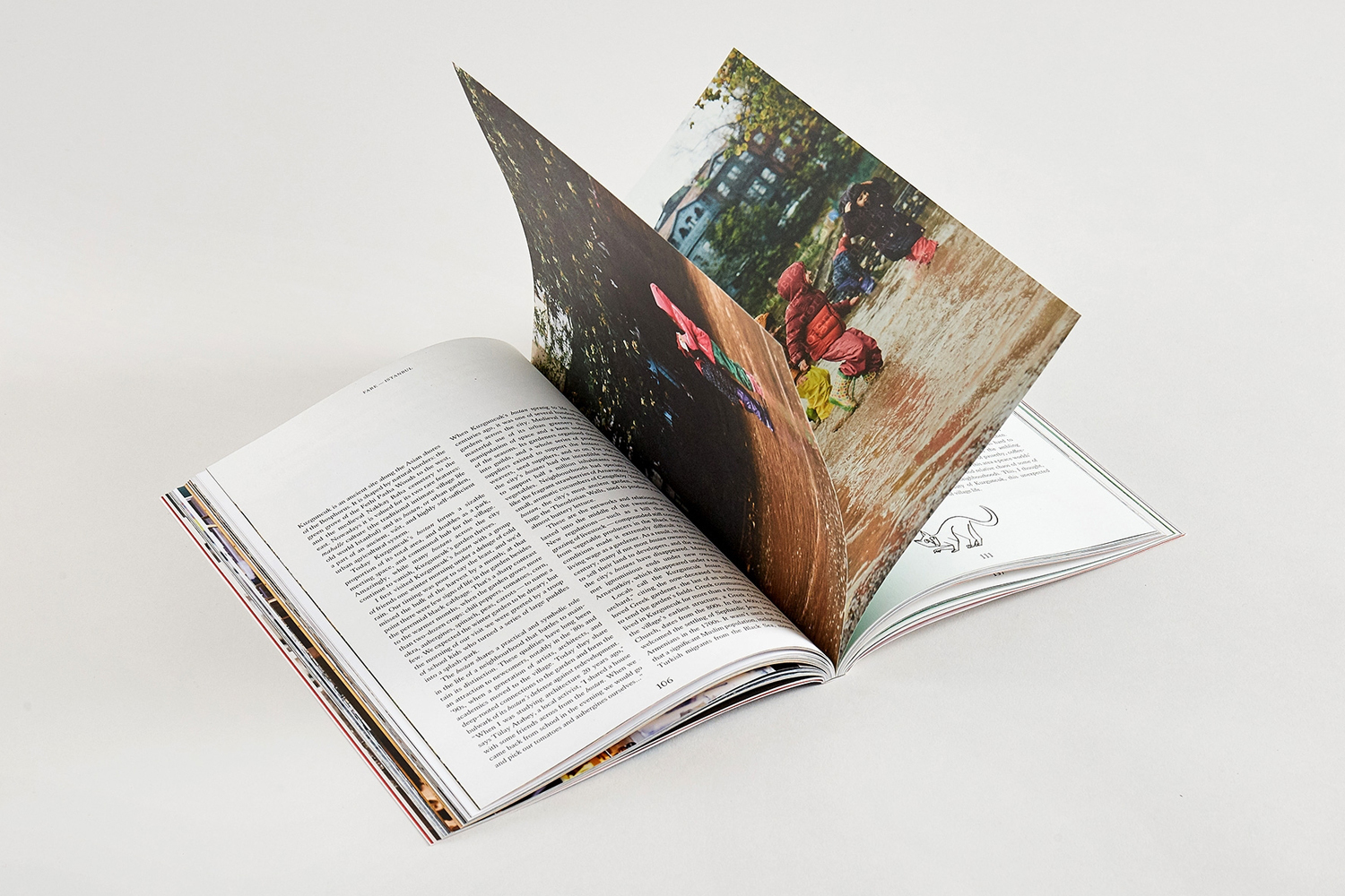
FARE Brand Identity 2018
Associated creatives

Tags
Description
An open magazine lies flat on a plain white surface, displaying a complex double-page spread from a FARE magazine brand identity project. The left page features dense columns of black typographic text, while the right page showcases a vibrant, high-angle photograph of children playing in an outdoor environment. The photograph on the right page shows a slight upward lift of the paper, creating a dynamic sense of depth. The layout reflects a professional editorial style, blending narrative photography with structured column-based typography. The lighting is even and soft, typical of a studio product presentation, highlighting the crisp paper quality and print detail of the publication.
Style
Editorial, Lifestyle
Techniques
Typography
Industries
Magazines