
BrandFARE
ProjectBrand Identity
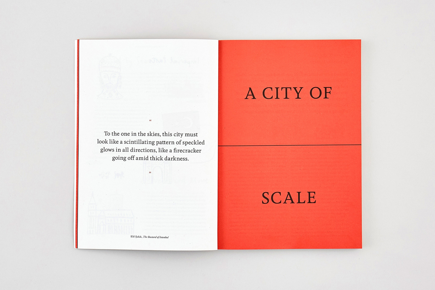
FARE Brand Identity 2018
Associated creatives

Tags
Description
An open book rests flat against a clean white seamless background, showcasing structured graphic design layouts across its spread. The left page features black serif typography alongside faint, delicate line illustrations and architectural sketches in light grey. The right page is a striking solid red panel bearing bold black capital lettering that reads A CITY OF SCALE. The composition is shot from a top-down perspective with soft, even lighting that highlights the paper texture and matte finish of the publication. This graphic design project was created for the brand FARE by Visie Admin.
Style
Horizontal, Commercial, Clean, Minimalist
Techniques
Typography
Color
Crimson (50%)
Off-White (50%)
Background
White Seamless
Context
Website / Web