
BrandFARE
ProjectBrand Identity
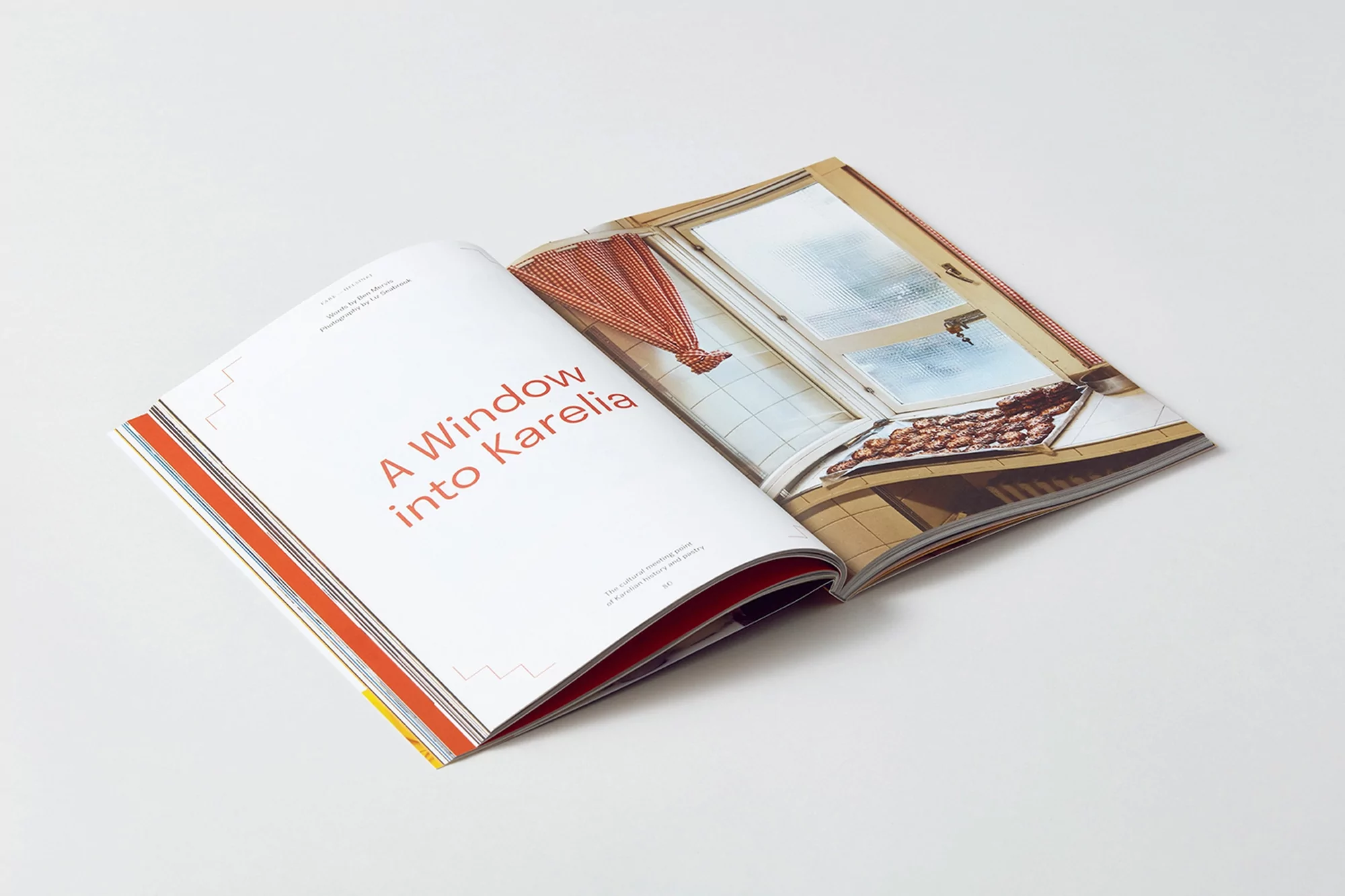
FARE Brand Identity 2019
Associated creatives

Tags
Description
An open magazine is displayed at an angle on a clean, solid white surface, forming part of the FARE brand identity project. The left page features minimal layout design with red typography reading A Window into Karelia alongside subtle graphic line details. The right page shows a full-colour photograph of a kitchen interior with red-and-white patterned curtains and baking trays. The spread is shot from a high angle, capturing the bound edge and crisp paper texture of the publication.
Style
Editorial, Horizontal, Clean, Minimalist
Techniques
Typography
Color
Pure White (70%)
Crimson (30%)
Background
White Seamless
Context
Editorial