
Brand
ProjectBrand Identity
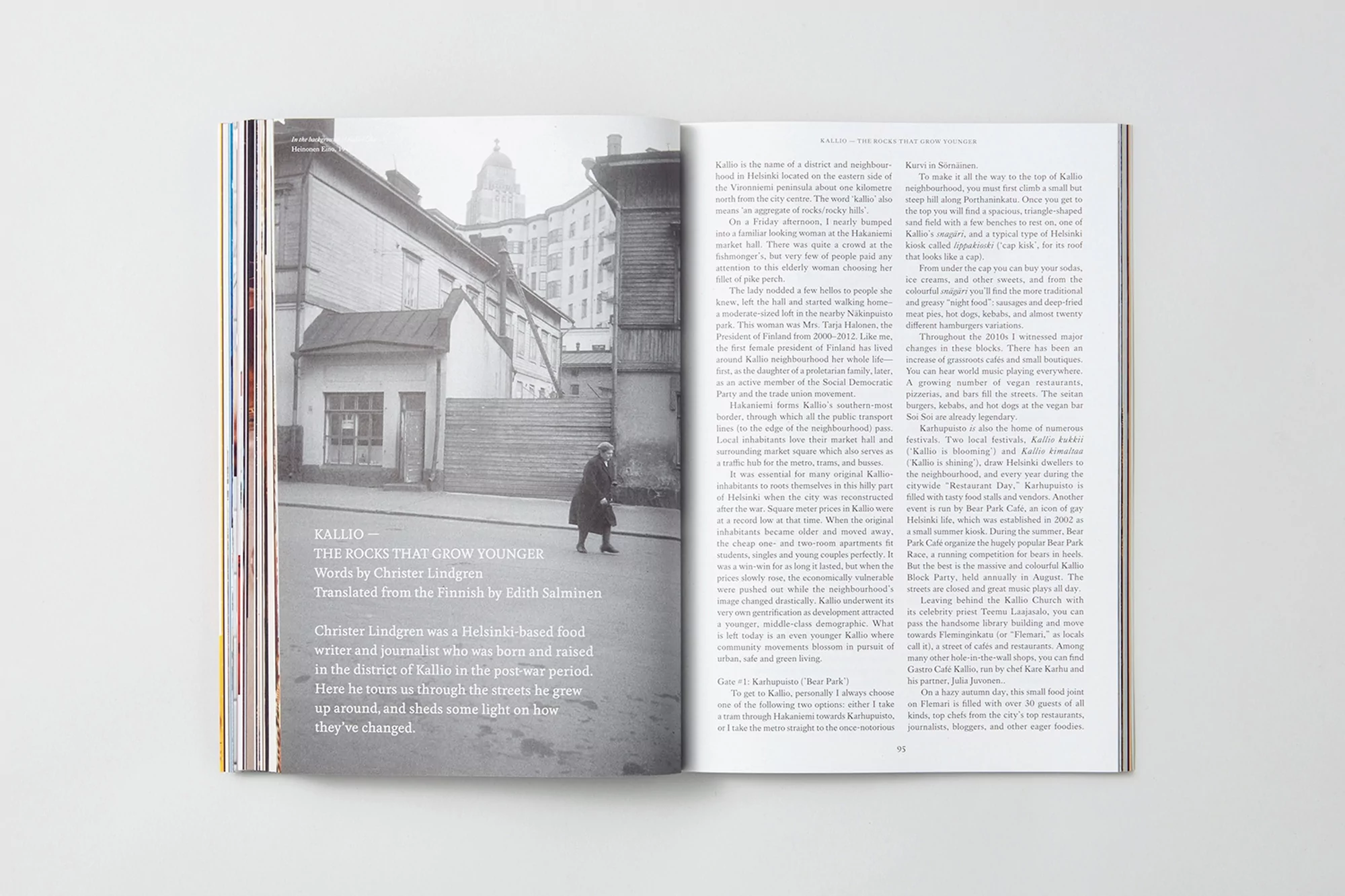
FARE Brand Identity 2019
Associated creatives

Tags
Description
This open magazine spread showcases a clean editorial layout designed for FARE under the brand identity project. The left page features a black and white architectural photograph of a city street with a lone figure walking past traditional buildings, paired with bold title typography and descriptive article text. The right page presents structured multi-column editorial copy set in a readable serif typeface alongside page numbering. The composition is captured from a straight-on top angle against a neutral white background, highlighting the tactile quality of the paper pages and the precise graphic design grid.