
BrandCanela Fina
ProjectBrand Identity
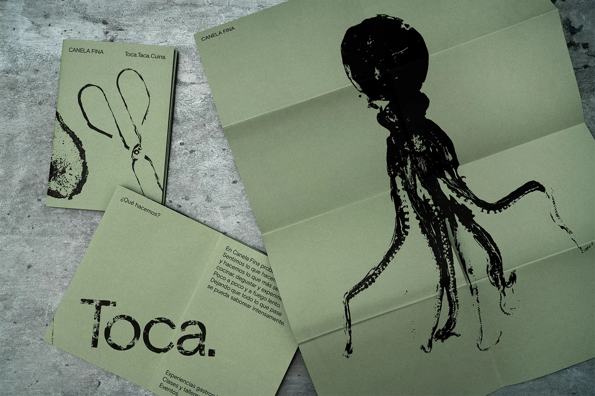
Canela Fina Brand Identity 2018
Associated creatives

Tags
Description
This graphic design composition features branding materials for Canela Fina, including a folded brochure and a smaller booklet. Both items are printed on matte sage green paper stock. The brochure showcases a bold, high-contrast black ink illustration of an octopus, while the booklet features a minimalist scissors icon. Spanish language typography is integrated into the layout alongside the brand name. The items are arranged on a neutral, gray, textured surface resembling concrete or stone. The presentation highlights a clean, organic aesthetic typical of high-end culinary or artisanal branding.
Style
Commercial, Corporate
Techniques
Typography, Ink
Industries
Restaurants