
Brand
ProjectBrand Identity
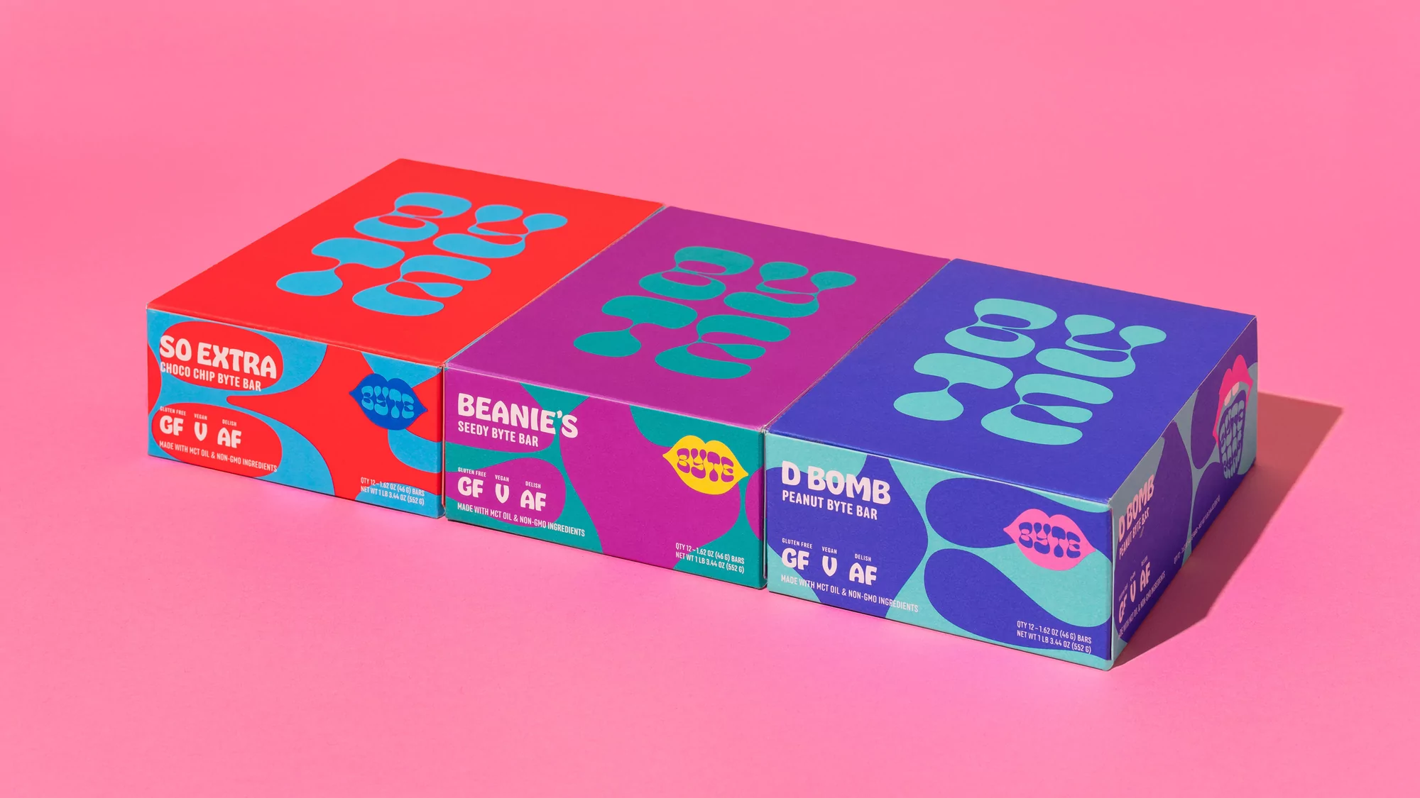
Byte Brand Identity 2020
Associated creatives

Tags
Description
Three colourful product boxes for Byte are arranged diagonally across a vibrant pink surface in a clean studio setting. The packaging features bold typography and distinct colourways including red, purple, and blue with graphic cyan accents. Designed by The Office of Ordinary Things as part of the Brand Identity project, the composition highlights playful branding and vibrant contrast. Soft studio lighting casts subtle shadows beneath each box, emphasizing their three-dimensional form. The overall aesthetic is graphic and contemporary.