
ProjectBrand Identity
Brand Identity 2017
Associated creatives

Tags
Description
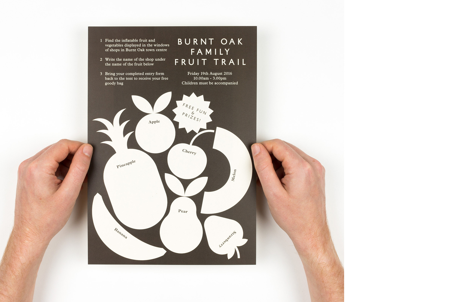
This brand identity project showcases a promotional flyer for the Burnt Oak Family Fruit Trail, designed by Maddison Graphic. Two hands hold the dark brown rectangular flyer, which features cream-colored vector illustrations of various fruits alongside clear typographic instructions and event details. The composition is photographed from a top-down perspective against a clean, neutral white background. The clean lines and bold typography establish an engaging community-focused visual system.
Style
Vertical, Commercial, Clean, Minimalist
Techniques
Vector
Color
Jet Black (70%)
Pure White (30%)
Background
White Seamless
Context
Advertising Campaign