
BrandBurnt Oak
ProjectBrand Identity
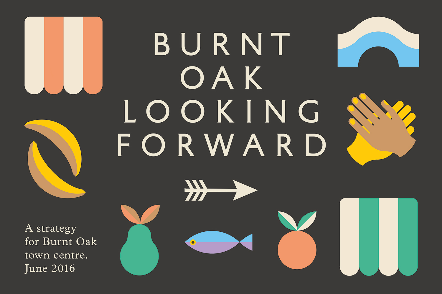
Burnt Oak Brand Identity 2017
Associated creatives

Tags
Description
This graphic design project by Maddison Graphic features a brand identity for Burnt Oak town centre presented on a dark grey background. Centred serif typography reads Burnt Oak Looking Forward, accompanied by smaller descriptive text in the lower left corner. The composition is surrounded by a series of colourful, flat vector icons including striped awnings, arched shapes, bananas, hands, an arrow, a pear, a fish, an orange, and green and white striped panels. The colour palette includes off-white, yellow, peach, blue, and green tones.
Style
Artistic, Horizontal, Graphic
Techniques
Typography, Vector
Industries
Digital Media & Publishers
Color
Off-White (50%)
Olive (20%)
Golden Yellow (20%)
Background
Solid Colour
Context
Advertising Campaign