
Brand
ProjectBrand Identity
The District, Graphic Design,
Associated creatives

Tags
Description
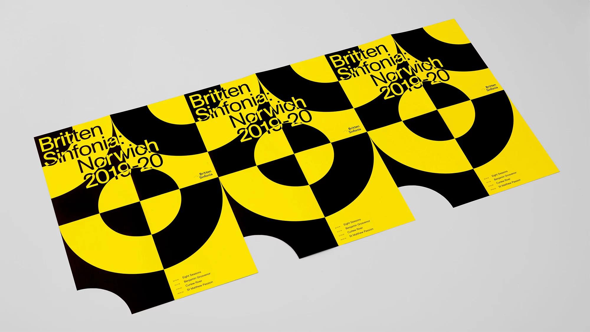
Graphic design brand identity project for Britten Sinfonia created by The District. Three identical posters are displayed diagonally on a neutral white surface, showcasing a high-contrast geometric pattern in vivid yellow and black. Bold sans-serif typography reads Britten Sinfonia Norwich 2019-20 alongside additional event details. The studio lighting creates soft shadows beneath the printed paper edges, highlighting the clean graphic composition.
Style
Horizontal, Commercial, Clean, Minimalist, Graphic
Techniques
Typography, Screen print / silkscreen
Industries
Music
Color
Golden Yellow (60%)
Jet Black (40%)
Background
White Seamless
Context
Advertising Campaign