BrandSAVEME
ProjectBrand Identity
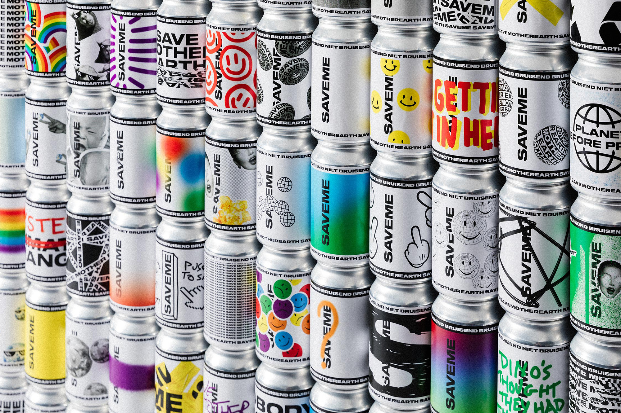
SAVEME Brand Identity 2021
Associated creatives

Tags
Description
A repeating arrangement of aluminum cans creates a visually engaging pattern. Each can features distinct graphic designs, predominantly in black, white, and silver, with splashes of colors. The repeated word "SAVEME" is prominent on most cans, along with a variety of graphics, including smiley faces, abstract patterns, and environmental imagery, all stacked in even rows. The lighting appears to be bright and even, enhancing the visibility of each design. The close-up shot captures the details of the can designs, and a shallow depth of field keeps the focus sharp on the central cans.