BrandCumulus Park
ProjectBrand Identity
Cumulus Park Brand Identity 2020
Associated creatives

Tags
Description
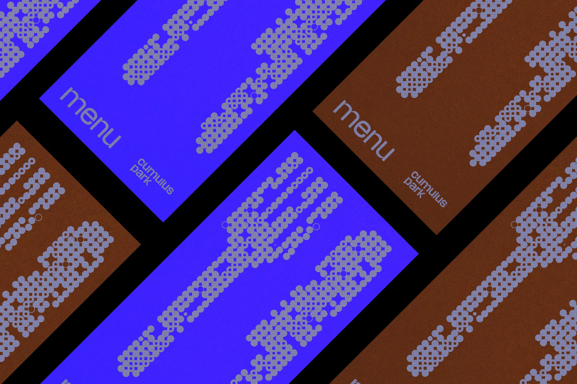
A high-angle shot showcases several menu mockups in two distinct colors, blue and brown, against a stark black background. Each mockup features a graphic fork design constructed from a pattern of dots, giving it a pixelated appearance. The name "Cumulus Park" is printed in a clean, sans-serif font on each mockup. The design aesthetic is modern and minimalist, focusing on the effective use of simple geometric shapes to create a recognizable image. The blue and brown contrasts sharply with the black, emphasizing the clean lines and shapes of the design.