BrandMerino
ProjectBrand Identity
Merino Brand Identity 2020
Associated creatives

Tags
Description
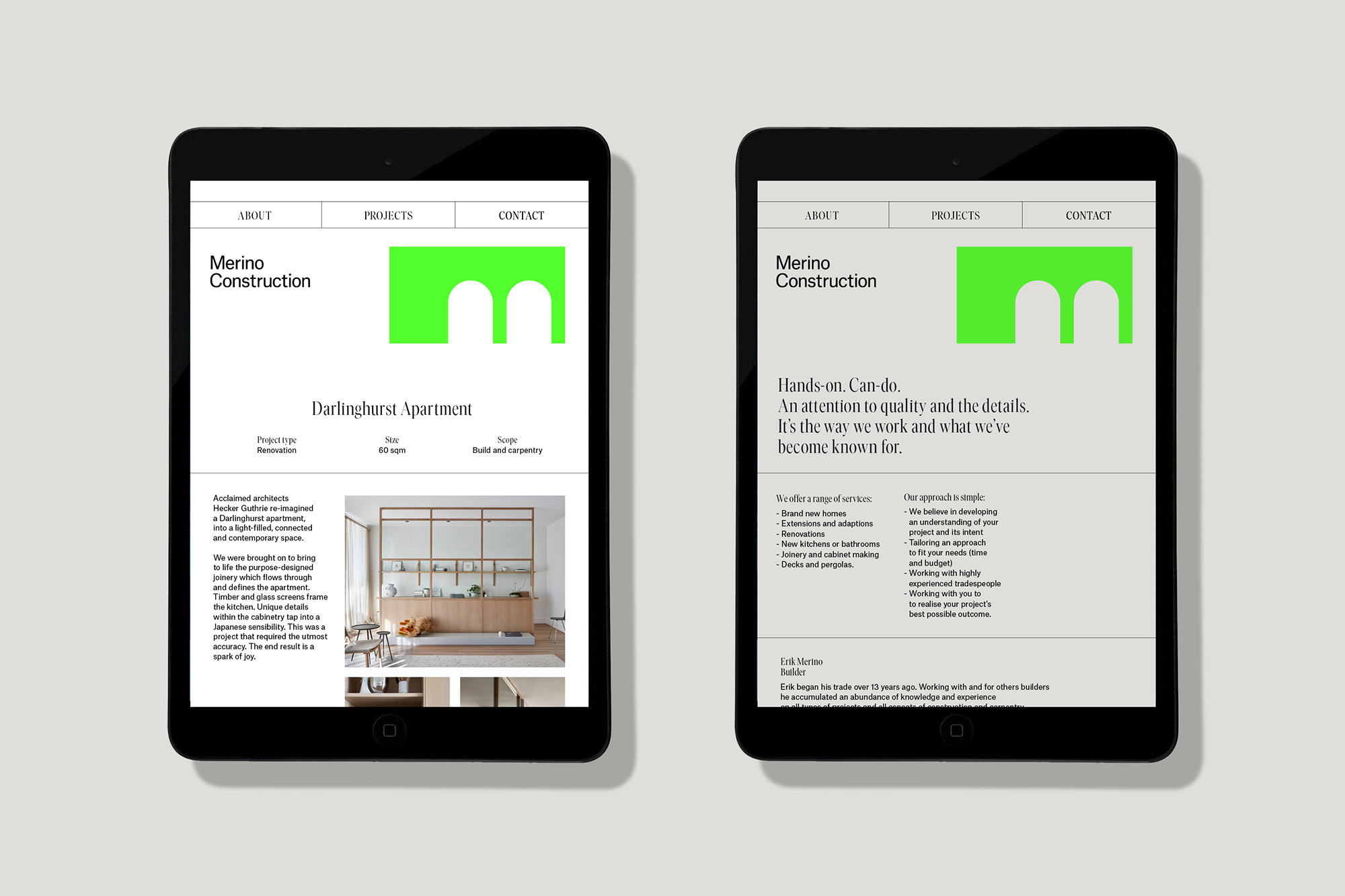
Two tablets are placed side-by-side, each displaying the website for Merino Construction. The website features a minimalist design with a green logo resembling an arch. One tablet shows the 'About,' 'Projects,' and 'Contact' navigation at the top, followed by the company name and project details for the 'Darlinghurst Apartment.' Below, there are images of the apartment's interior, showcasing modern design elements. The second tablet displays similar navigation but focuses on text describing the company's hands-on approach, attention to detail, and services offered. The background is a plain, light grey, emphasizing the tablets and their content.