BrandSheraton
ProjectBrand Identity
Sheraton Brand Identity 2020
Associated creatives

Tags
Description
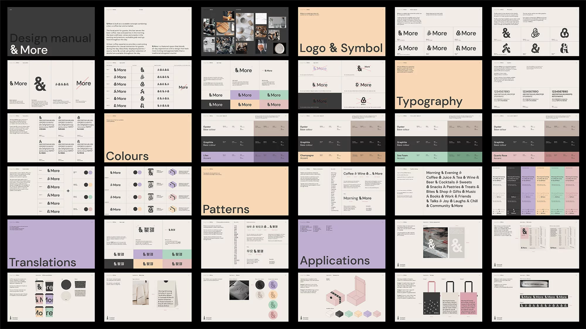
This image presents a design manual for a brand named "& More", visually structured into sections covering logo and symbol usage, typography guidelines, color palettes, pattern examples, translations, and brand applications. The layout is clean with a minimalist aesthetic, employing a neutral background and sans-serif typography. Each section demonstrates various brand elements and their application across different media, such as stationery, packaging, and digital interfaces. The color scheme includes muted pastels and monochrome tones, contributing to a consistent and modern brand identity. Various mockups are on display showcasing how the branding can be translated across merchandise and marketing materials.