BrandHKUMed
ProjectBrand Identity
HKUMed Brand Identity 2020
Associated creatives

Tags
Description
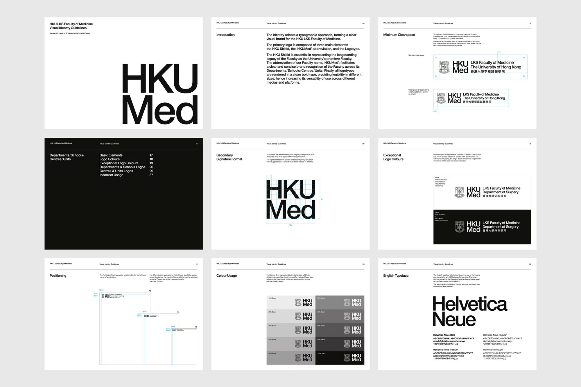
The image displays a series of panels showcasing the visual identity guidelines for HKU Med, the Hong Kong University Faculty of Medicine. The panels cover various aspects of the brand's visual language, including logo usage, typography (Helvetica Neue), color palette (ranging from light grays to black), and clear space guidelines. The design is clean and modern, emphasizing a consistent and professional brand image. The guidelines aim to ensure that the HKU Med brand is presented uniformly across different media and platforms. The panels are set against a light background, enhancing the clarity of the visual elements. Text is in English.