BrandHKUMed
ProjectBrand Identity
HKUMed Brand Identity 2020
Associated creatives

Tags
Description
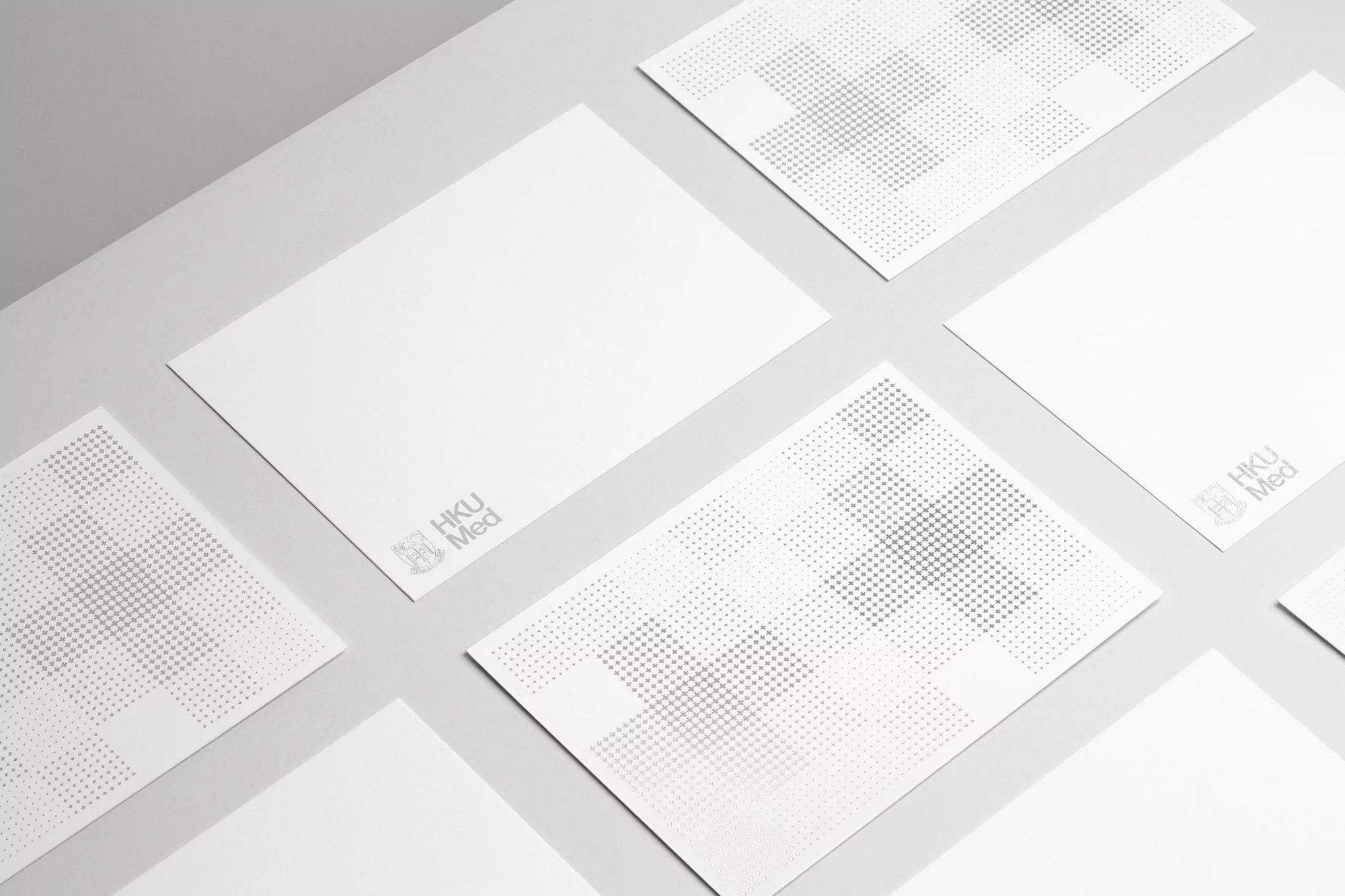
A high-angle studio shot displays several white cards arranged on a light gray surface. Some of the cards are blank, while others are printed with subtle gray geometric patterns of dots creating crosses and squares. Each card bears a small logo that reads 'HKU Med' in a muted gray tone, indicating the brand. The lighting is soft and diffused, enhancing the minimalist aesthetic and clean design. The cards are positioned at various angles, adding a dynamic element to the composition. The even lighting and lack of shadows contribute to the sleek, professional appearance, typical of product and marketing materials.