United Sodas of America Brand Identity 2020
Associated creatives


Tags
Description
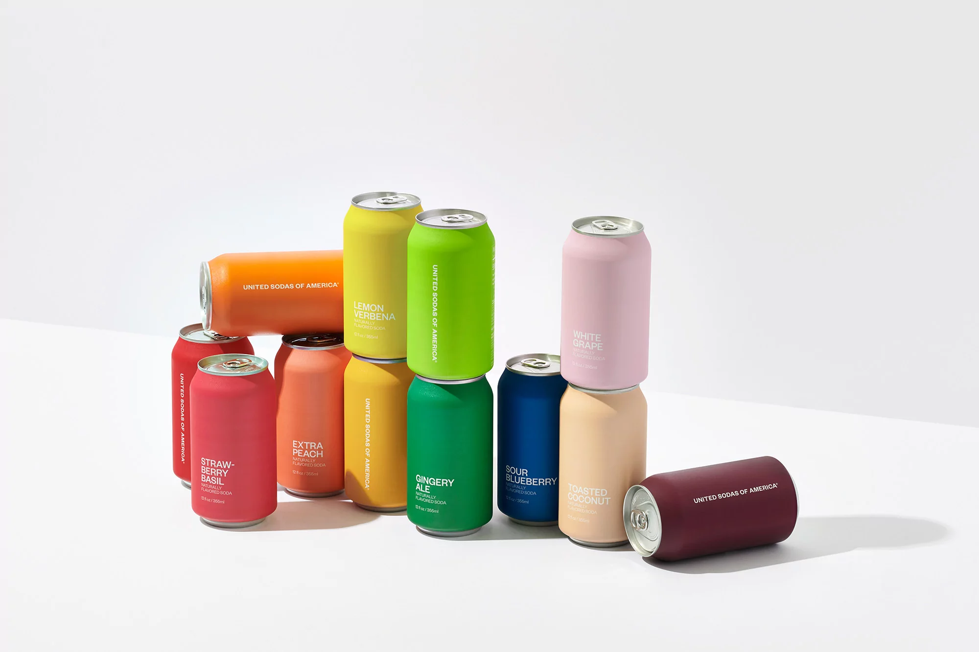
A minimalist studio product shot showcases an array of colorful United Sodas of America cans, each a different vibrant hue corresponding to its fruit flavor. The cans are stacked and arranged to create visual interest, with some cans standing upright and others laid on their sides. The color palette includes shades of red, orange, yellow, green, blue, and pink, each can labeled with the flavor name and the company's branding in a clean, sans-serif font. The background is a pristine white, providing a clean, high-key contrast that accentuates the colors and form of the cans. The lighting is bright and even, minimizing shadows and highlighting the matte finish of the cans. The overall composition suggests a modern, playful, and refreshing aesthetic.