BrandWilder Fields
ProjectBrand Identity
Wilder Fields Brand Identity 2020
Associated creatives


Tags
Description
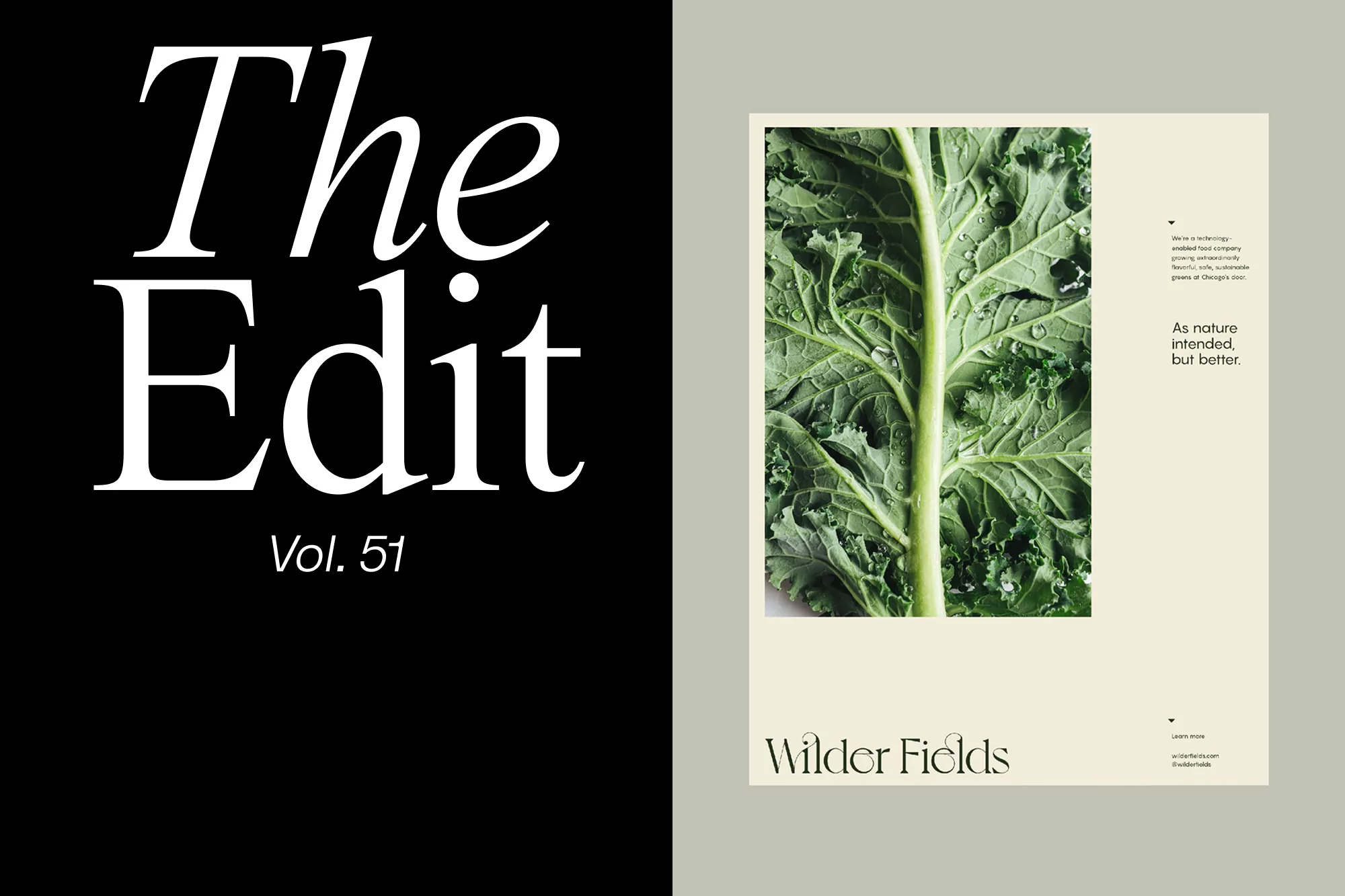
A magazine cover is split into two contrasting sections. On the left, bold white text reading "The Edit Vol. 51" stands out against a solid black background. To the right, a close-up shot of a vibrant green kale plant fills the frame, water droplets accentuating its texture. The kale image is set against a pale tan background that contains the text "Wilder Fields" in a smaller, elegant font, along with additional fine print details. The overall design has a clean, minimalist aesthetic with a focus on natural elements and bold typography.