BrandFARE
ProjectBrand Identity
FARE Brand Identity 2019
Associated creatives

Tags
Description
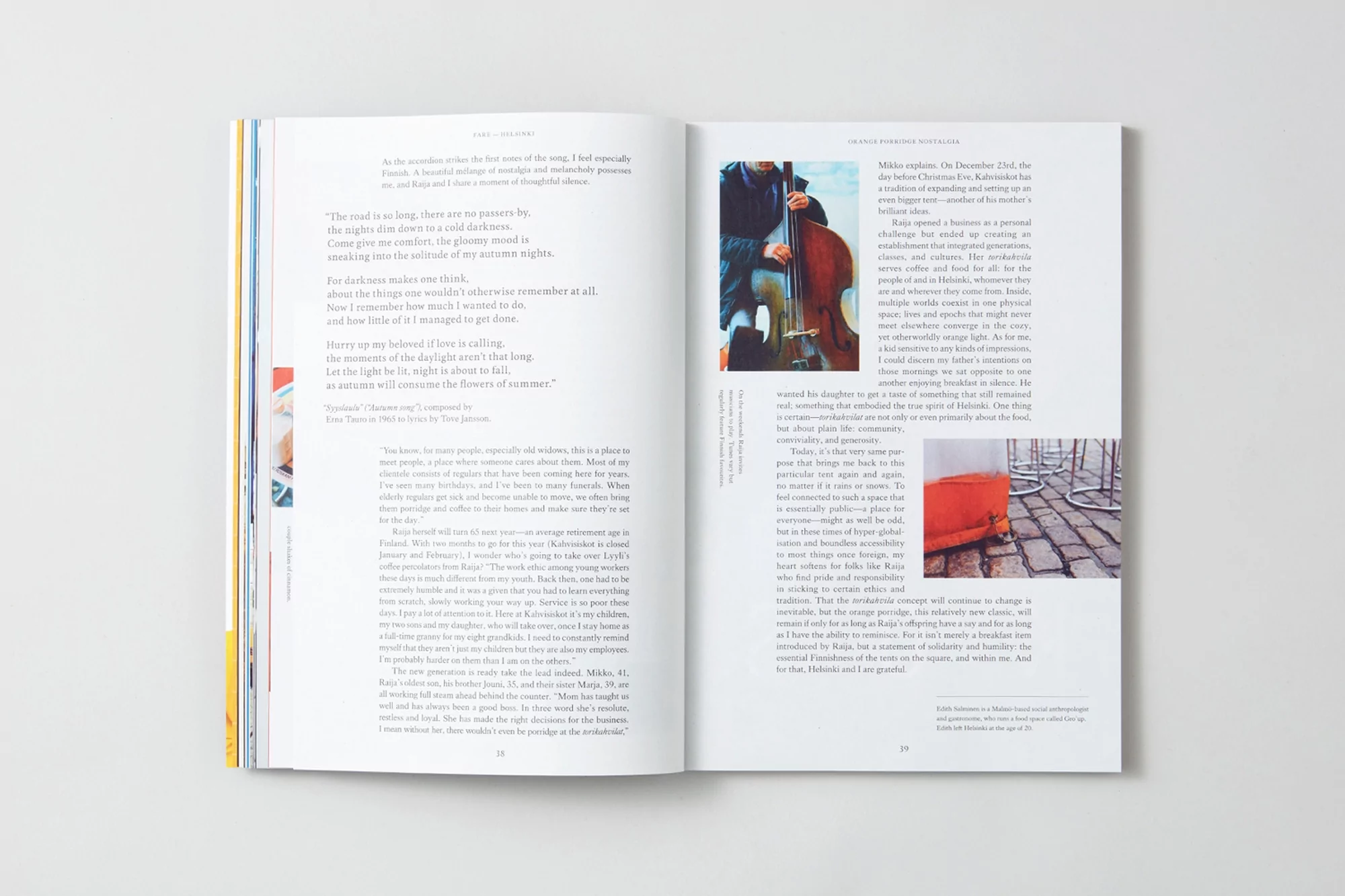
An open magazine spread presents a blend of visual and textual content. On the left page, literary text fills the majority of the space. The right page features a cellist in action, their hands poised over the instrument in mid-performance, and a photograph of an orange container situated in an urban setting with light-colored stones. The magazine's design is clean and minimalistic, with a focus on typography and visual hierarchy. The color palette is subdued, enhancing the sophistication and depth of the magazine's content.