BrandBritten Sinfonia
ProjectBrand Identity
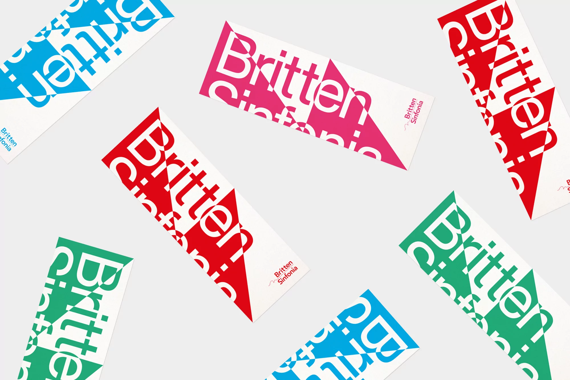
Britten Sinfonia Brand Identity 2019
Associated creatives

Tags
Description
An overhead shot displays several white cards with colorful graphic designs, arranged on a light gray surface. The cards feature a graphic that incorporates a triangular shape and bold typography. The brand name 'Britten Sinfonia' is printed on each card, with the 'Britten' text being larger and more prominent. The designs vary in color, featuring shades of red, pink, blue, and green. The layout is clean and modern, with the cards scattered in a seemingly random yet visually pleasing manner. The flat lay composition emphasizes the graphic elements and color contrasts, making it suitable for showcasing graphic design.