BrandPorto City Theatre
ProjectBrand Identity
Porto City Theatre Brand Identity 2019
Associated creatives

Tags
Description
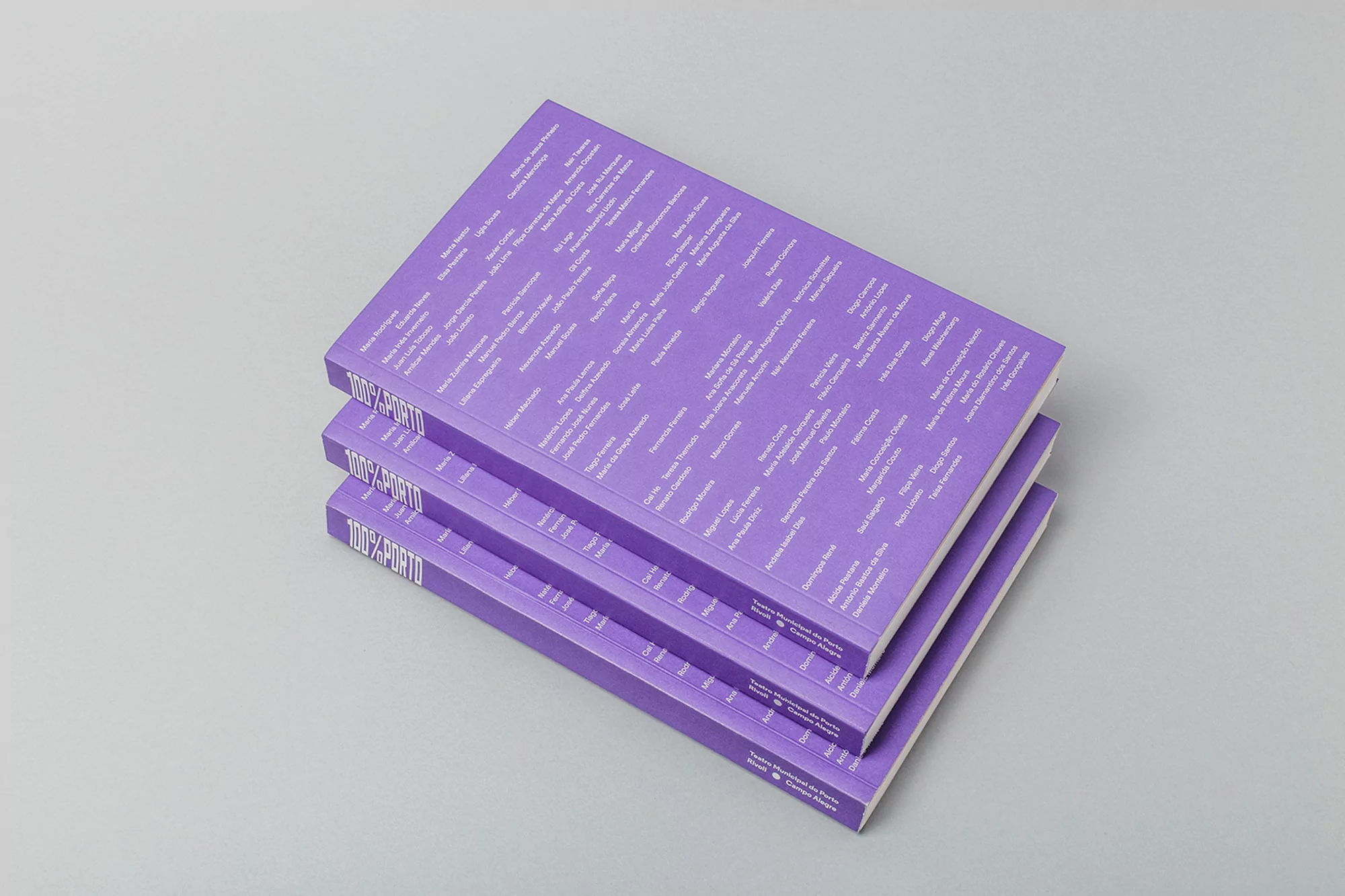
Three books with violet covers are stacked on top of each other on a light gray surface. The books are identical and appear to be the same edition. The cover design includes a pattern of light gray text consisting of names and titles. The spine of each book features the title '100% PORTO' in bold, sans-serif letters. The stack is arranged neatly, with the covers and spines aligned. The lighting is soft and even, creating minimal shadows and emphasizing the colors and textures of the books and surface. The image has a clean and minimalist aesthetic, focusing on the visual presentation of the books and their design elements.