Black Isle Bakery Brand Identity 2018
Associated creatives

Tags
Description
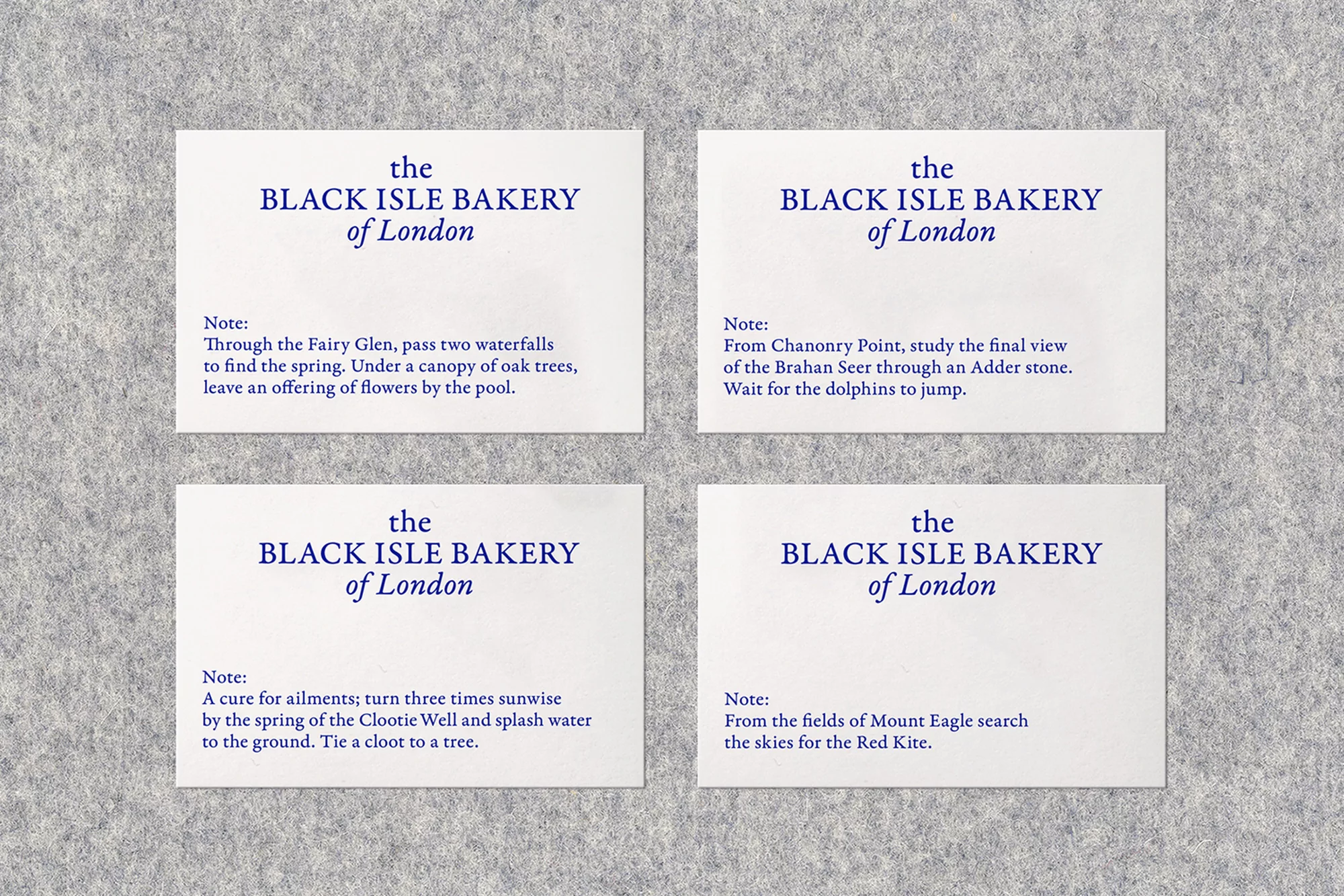
Four white cards are arranged on a textured gray background, each bearing the brand name "The Black Isle Bakery of London" in a stylized, dark-blue serif typeface. Below the brand name, each card features a unique, short paragraph in a smaller font. The paragraphs contain literary and lyrical language, referencing natural elements, folklore, and Scottish landscapes. The texts evoke a sense of place and narrative, contrasting the brand's name with poetic imagery. The background is a solid, light-gray felt, which provides a neutral backdrop that allows the text on the cards to stand out. The lighting is soft and even, illuminating the scene without casting harsh shadows. The flat lay composition with a slightly high angle offers a clear view of all four cards and their texts, emphasizing the content and layout.