BrandCappelletti family
ProjectBrand Identity
Cappelletti family Brand Identity 2018
Associated creatives

Tags
Description
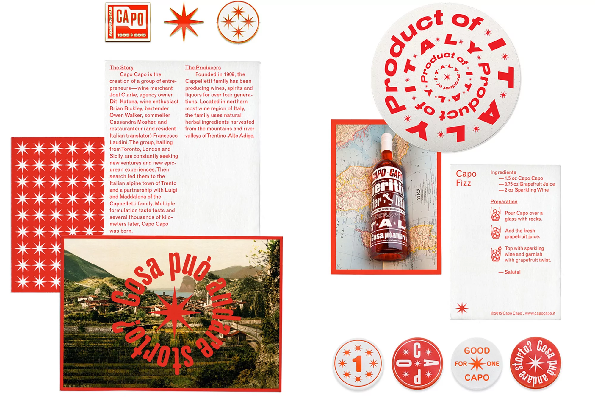
A promotional shot showcases Capo Capo aperitivo with supporting materials. A bottle of Capo Capo stands on a map of Italy beneath a product badge featuring red text on a white background. To the left, a white paper displays text describing the brand's story and producers, along with a pattern of red stars and an image of an Italian landscape with overlayed text. Additional product badges and a recipe for Capo Fizz are arranged around the bottle. The color scheme is dominated by red and white, creating a cohesive brand aesthetic. The shot is brightly lit, emphasizing the clean design and text-based branding.