
ProjectBrand Identity
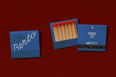
Berto reworks the osteria’s codes Brand Identity 2026
Associated creatives


Tags
Description
This editorial product photograph showcases custom blue matchbooks arranged on a rich, solid dark red surface as part of a brand identity project for Berto reworks the osteria's codes. Designed by Jean-Michel Mercier and photographed by Eliane Cadieux, the flat lay composition features three matchbook elements displaying distinct typography. One closed matchbook shows white script branding reading Berto, an open matchbook reveals a row of matches with bright red heads, and a third matchbook features stacked white serif text reading A PRESTO TO AMICI! above a dark strike strip. The clean, minimalist studio presentation emphasizes tactile paper textures and a bold primary color palette.