
Brand
ProjectBrand Identity
Rachael Gibilterra, Projects by,
Associated creatives


Tags
Description
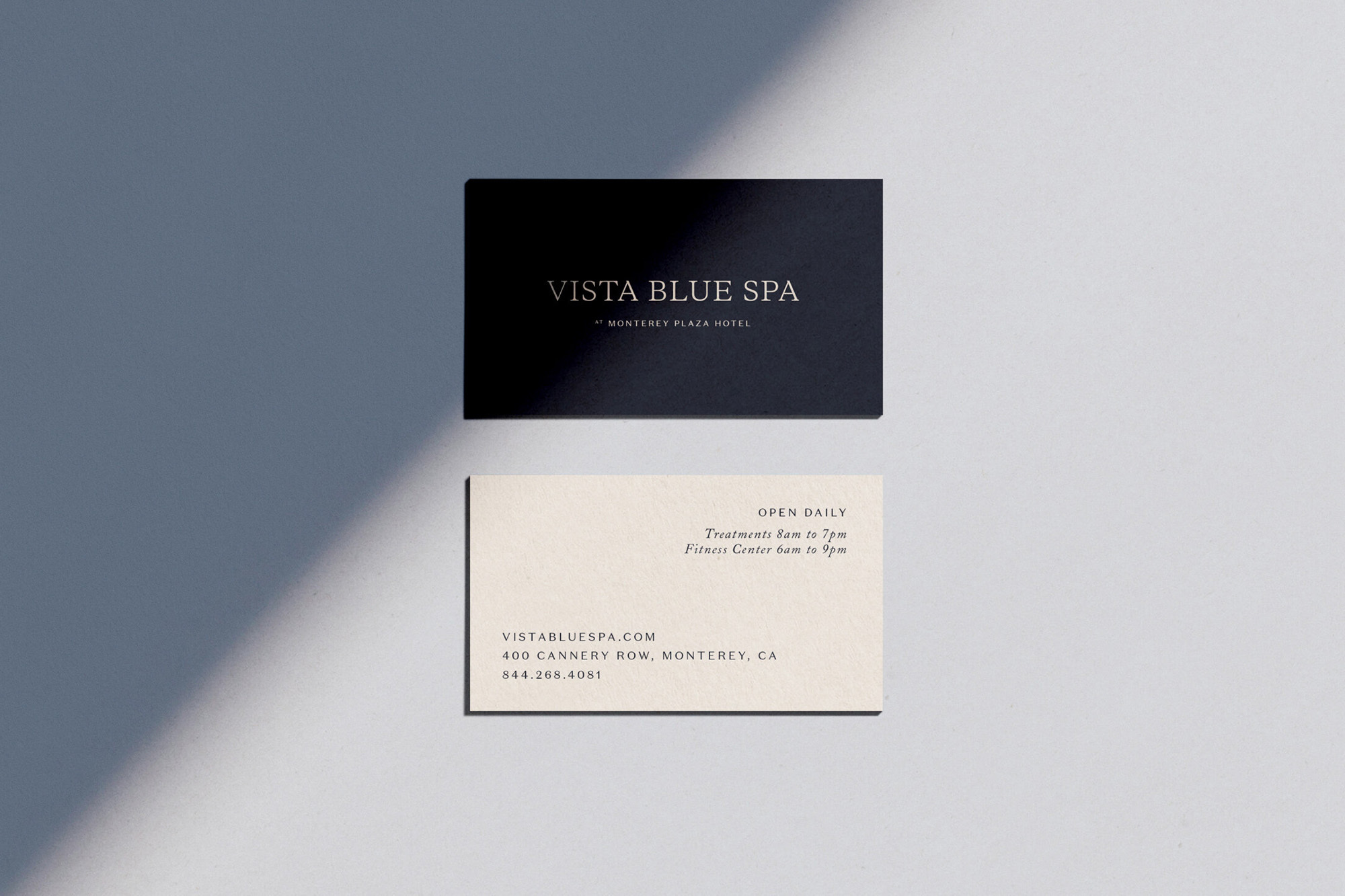
This project showcase presents two contrasting business cards for Away Days Brewing Co, laid out flat on a pale grey surface. The top card is a deep black with minimalist typography, while the lower card is a textured cream stock featuring clean serif text. A sharp diagonal shadow cuts across the composition, creating subtle depth and clean architectural lines. The arrangement highlights modern stationery design and considered typography within a corporate branding system.
Style
Horizontal, Commercial, Clean, Minimalist
Techniques
Natural light
Color
Jet Black (50%)
Cream (50%)
Background
Grey Seamless
Context
Advertising Campaign