
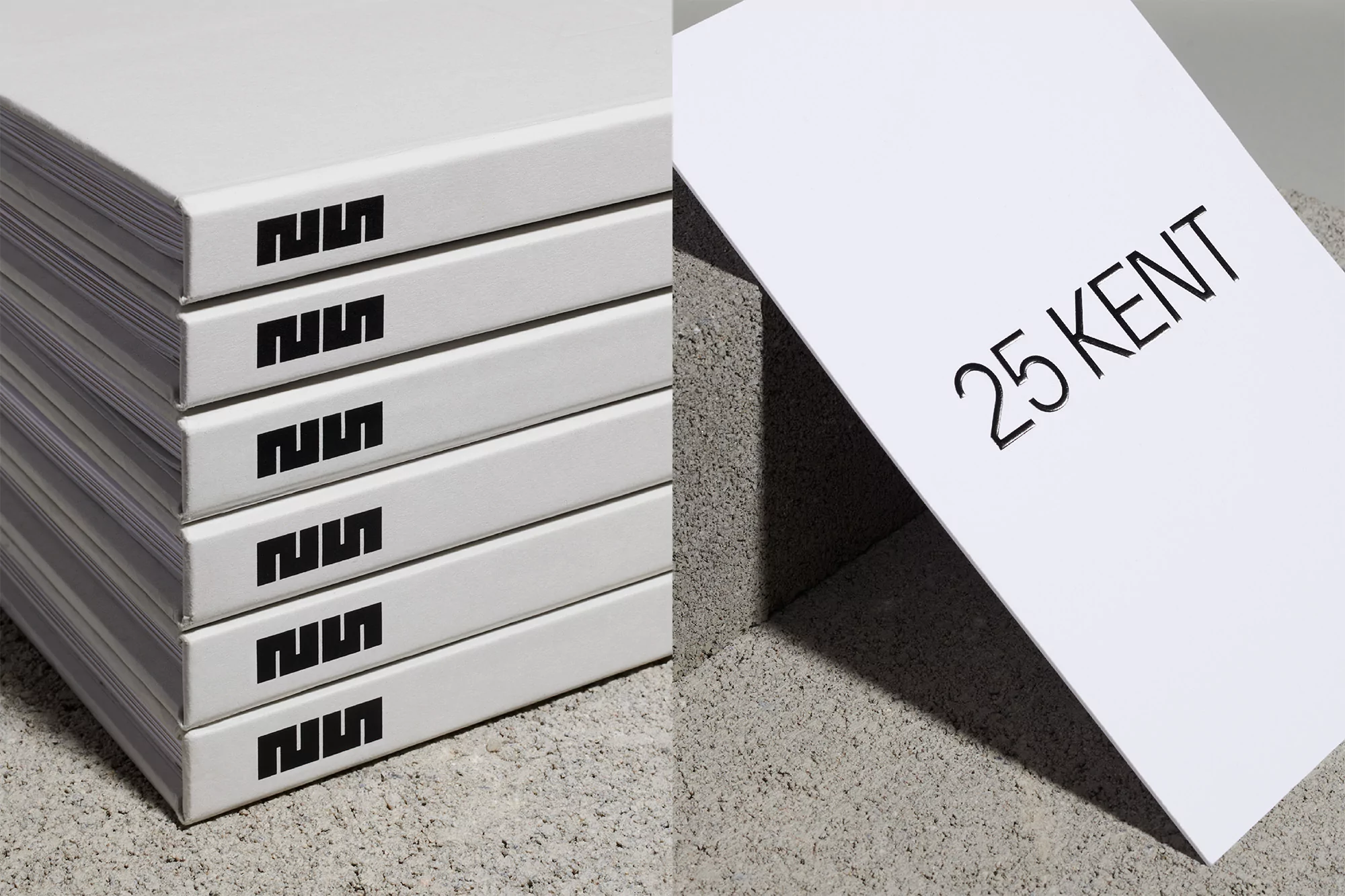
unknown Brand Identity 2020
Associated creatives

Tags
Description
This image displays high-quality brand identity print collateral for 25 Kent, featuring a stack of six identical white hardbound books with a distinct black geometric logo printed repeatedly on each spine. Beside the stack, a white promotional brochure rests at an angle against a rough, grey concrete block, displaying the text 25 KENT in a clean, sans-serif font. The composition uses a minimalist aesthetic, pairing the smooth white surfaces of the paper products with the coarse, tactile texture of the concrete. Soft, directional lighting creates sharp shadows, emphasizing the architectural and industrial nature of the brand presentation. The clean colour palette of white, black, and grey reflects a professional and modern graphic design approach.
Style
Commercial, Corporate
Techniques
Typography, Soft Light
Industries
Digital Media & Publishers