
vinvinvin: Brand Identity




Jan 2020
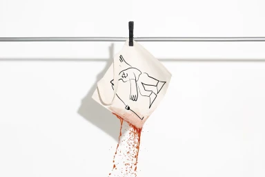
The brand identity for vinvinvin signals a refreshing departure from traditional viticulture marketing, leaning instead into a playful, artistic language that feels inherently human. By distilling the essence of the wine-drinking experience into a series of minimalist line illustrations and vibrant, flat-color fields, the project establishes a visual system that is as much about the people who serve and enjoy the liquid as it is about the bottle itself. Graphic designer Nother has masterfully utilized clean, sans-serif typography paired with gestural, hand-drawn motifs to create a cohesive aesthetic that spans everything from bottle labels to custom glassware and canvas tote bags. The execution relies heavily on intentional contrast, whether through the stark interplay of white lines against bold, primary-colored backgrounds or the juxtaposition of smooth, modern packaging against the rustic, grainy texture of natural wine corks. By leveraging high-key natural light and minimalist still life compositions, the work achieves a contemporary feel that fits seamlessly into modern lifestyle feeds. The use of vector-based iconography and clever, fluid illustrations transforms the act of drinking into an evocative, narrative experience. Ultimately, the identity is defined by its ability to remain functional and professional while maintaining a whimsical, human-centric charm that communicates gratitude and celebration without needing to say a word.
Horizontal, Commercial, Clean
Advertising Campaign
